| Image |
Comment |
| 05/17/2006 05:13:10 PM |
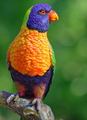
THE BIRD.by CONRADComment by Dr.Confuser: I gave this photo a 1 because it didn't seem to me to fulfill my expectation of a "still life," a classic form of artfully arranged objects. Call me narrow minded but that's the way I see it. |
| 05/17/2006 10:47:51 AM |
|
| 05/16/2006 03:54:32 AM |
|
| 05/15/2006 09:32:15 AM |
|
| 05/15/2006 02:43:40 AM |
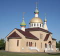
THREE CROSSESby CONRADComment by bgslaw: I like the colors in the top. I think maybe a little more cropping to accent the top. But then I am new. |
| 05/14/2006 11:58:31 PM |
|
| 05/14/2006 11:51:57 PM |
THREE CROSSESby CONRADComment by Lustre: As well as some perspective distortion (ie: top of building is narrower than bottom) - which I don't really mind - this image looks a little rotated. Perhaps its just the distortion tricking my eyes though. Also, a little sharpening in an image editor would really bring this shot to life. |
| 05/14/2006 12:18:21 PM |
THREE CROSSESby CONRADComment by livitup: The biggest problem I have with this photo is that is seems to lean to the bottom right. Perhaps a simple rotation counter-clockwise in photoshop to straighten things up would have helped a bit. |
| 05/10/2006 06:55:27 PM |
THREE CROSSESby CONRADComment by pjangel: This is okay...I would like to have seen something a little more creative. Maybe a different view. |
| 05/10/2006 02:31:16 PM |
THREE CROSSESby CONRADComment by KarenNfld: That's a nice looking building but your photo needs some improvements. It is tilted slightly to the right and it seems washed out. A polarizing filter would help, or adjusting the contrast. |
Home -
Challenges -
Community -
League -
Photos -
Cameras -
Lenses -
Learn -
Help -
Terms of Use -
Privacy -
Top ^
DPChallenge, and website content and design, Copyright © 2001-2025 Challenging Technologies, LLC.
All digital photo copyrights belong to the photographers and may not be used without permission.
Current Server Time: 04/07/2025 11:37:03 AM EDT.