| Image |
Comment |
| 10/07/2005 06:02:51 PM |
|
 Photographer found comment helpful. Photographer found comment helpful. |
| 10/01/2005 06:42:13 AM |
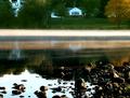
August-Sundown-in-Wakefield.jpgby reeldeal4Comment by glad2badad: This looks like a practice run for the Complementary Colors challenge. If not it could be. ;^) I love the simple colors with Orange, Black, and Purple. The composition is nice with the distribution of color being fairly even into thirds. Exposure is good as you've captured the lighting of this scene very well. The shadows from trees over the water at the far left give the image an appearance of being slightly off - like it needs a CW rotation of 1 or 2 degrees. Overall, very nice. Great job of seeing this and capturing it. |
| Photographer found comment helpful. |
| 09/18/2005 08:36:19 AM |
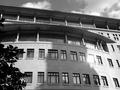
A Budding Judicial Branchby reeldeal4Comment by fstopopen: Greetings from the critique club.
This photo is a good example of thinking outside of the box a little. I know in the branch challenge a vast majority of the pics were actual tree branches. I like that this is different but not stretching the intent of the challenge.
Exposure. This seems to be spot on. I know that the reflection of the sun is blown out, and I don't mind that because it brings out the intensity of the sun.
Composition. I feel like this is where this photo could have been improved the most. When shooting architecture it is often difficult to find an angle that is unique and dynamic. My first suggestion would be to follow the rule of thirds a little more rigidly. This is almost a straight on shot. I think the building would look better if you were at a more dramatic angle from the front. I usually shoot at about 45 degrees. Also, that tree to the left is distracting. There is not enough of it there to actually be a part of the compostition, but it is still there. Perhaps if you took 10 steps to the left the building would have looked more 3 dimensional and you would have been able to include the tree in more of the composition (rule of thirds) This would also help your diagonals. Notice the top edge of the building is a slight diagonal. Further to the left and that diagonal would draw your eye around the image.
Post processing. I love the black and white treatment you have done on this image. Your blacks are black and whites are white. Not too much in the ugly middle range. You have done well. You have a very good grasp on how to make a black and white image. |
| Photographer found comment helpful. |
| 09/11/2005 02:37:52 AM |
|
| Photographer found comment helpful. |
| 09/09/2005 02:05:03 PM |
|
| Photographer found comment helpful. |
| 09/08/2005 02:37:45 PM |
|
| 09/07/2005 03:57:05 PM |
|
| Photographer found comment helpful. |
| 09/07/2005 05:55:51 AM |
|
| Photographer found comment helpful. |
Home -
Challenges -
Community -
League -
Photos -
Cameras -
Lenses -
Learn -
Help -
Terms of Use -
Privacy -
Top ^
DPChallenge, and website content and design, Copyright © 2001-2025 Challenging Technologies, LLC.
All digital photo copyrights belong to the photographers and may not be used without permission.
Current Server Time: 04/07/2025 07:12:36 AM EDT.