| Image |
Comment |
| 01/20/2006 12:22:24 PM |
|
| 01/20/2006 10:27:00 AM |
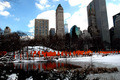
Christo's Gates Central Park - Feb 2005by CoolsComment by LalliSig: Not a bad shot really but I count 4 details that would just make this shot soo much better IMHO. 1. The image is tilted to the left wich I dislike. 2. The clouds are totally blown out. 3. The top of the tallest building seems unnessecarily cut off, if I had taken this shot I would rather have skipped some of the foreground and included the whole building. 4. Those branches in the upper left corner should have been edited out, they add nothing to the shot IMHO. |
| 01/20/2006 08:23:10 AM |
|
| 01/20/2006 03:46:03 AM |
Christo's Gates Central Park - Feb 2005by CoolsComment by Konador: I think the contrast is a bit high here, since you've lost some shadow detail, and the clouds are overexposed. I also think you should maybe have done some distortion adjustments in photoshop to get all the buildings straight. |
| 01/19/2006 02:49:05 PM |
|
| 01/18/2006 05:10:13 PM |
|
| 01/17/2006 05:34:31 AM |
Christo's Gates Central Park - Feb 2005by CoolsComment by ugas1a: Nice but the lake and the lacey trees on the left tend to throw it off balance. maybe you could have moved more to the right and cropped out that element. Also capturing the movement of the "gates" in the wind would have been a great addition. Movement against the stability of the skyscrapers would have made for a nice contrast. |
| 01/16/2006 11:04:22 AM |
|
| 10/22/2005 10:40:11 PM |
|
| 10/21/2005 01:53:53 PM |
|
Home -
Challenges -
Community -
League -
Photos -
Cameras -
Lenses -
Learn -
Help -
Terms of Use -
Privacy -
Top ^
DPChallenge, and website content and design, Copyright © 2001-2025 Challenging Technologies, LLC.
All digital photo copyrights belong to the photographers and may not be used without permission.
Current Server Time: 04/07/2025 11:50:38 AM EDT.