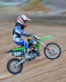
Quick ascentby
ProwlerComment by truogre: *Critique Club*
A great panning shot, good action, subject and colors. The focus is a bit soft, but not truly distracting. The background is nicely done and shows motion.
Cropping is a bit tight which kind of forces the viewer to see that some of the uniform lettering and other areas are soft, though the bike is fairly sharp. A bit more of the track in front of the rider would also move the subject to the left of center a bit and give the viewer a sense of perspective(where the rider is going).
The main colors here are red, blue and green always a good combo - the problem is the red and blue look a bit washed out, not hot, but lacking a bit of normal contrast. I believe that this might be due to the shadow highlight function, it tends to wash out colors. Next time you use it make a hue and saturation layer and give the dominant colors in your shot a little boost(try the individual colors instead of the RGB setting - they can be found in the drop down box).
Something you might try next time - Use a bit faster shutter speed (in the 1/125 or higher) capture the bike and rider in sharp focus, use the shadow/highlight function if needed, then use the hue and saturation function on your dominant colors. If the background is not blurred to your liking - then add a duplicate layer use the blur filter then a layer mask to paint the rider back in. (Though this might not be "legal" for a challenge here as it does add a motion feature - it would make for an excellent photo!!)
Overall - it is a good sports panning shot, a difficult technique to master, but one you have done a good job with.
Russ