| Image |
Comment |
| 01/17/2008 11:35:34 AM |
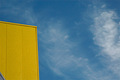
Yello Wallby iamkmaniamComment by bvy: A bit grainy and the clipped triangular portion of the building is a bit distracting. |
 Photographer found comment helpful. Photographer found comment helpful. |
| 01/16/2008 09:08:45 AM |
Yello Wallby iamkmaniamComment by Quasimojo: I like the simplicity of this shot but I think to make a bolder statement the grey in the bottom left needs to be cropped out to create a clearer tension between yellow and sky. |
| Photographer found comment helpful. |
| 12/25/2007 10:21:31 AM |
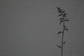
Oneby iamkmaniamComment by Crisik: I suggest to add some contrast to the image (for example by making the wall lighter, possibly in bw), it could still retain its gloomy mood and become more attractive |
| Photographer found comment helpful. |
| 12/24/2007 07:41:12 AM |
Oneby iamkmaniamComment by Yo_Spiff: This could be really good if not for the low contrast. That really hurts it. |
| Photographer found comment helpful. |
| 12/23/2007 04:57:24 PM |
|
| Photographer found comment helpful. |
| 12/23/2007 04:47:23 PM |
|
| 12/21/2007 05:25:15 PM |
|
| Photographer found comment helpful. |
| 12/21/2007 01:36:00 PM |
Oneby iamkmaniamComment by wardmac: Very simple. Good idea. I do however like to see tall subjects in portrait mode and wide subjects in landscape. So to me, this has too much dead space on the left. A little light in contrast too. |
| Photographer found comment helpful. |
| 12/21/2007 04:38:24 AM |
|
| Photographer found comment helpful. |
| 12/20/2007 10:40:10 PM |
|
| Photographer found comment helpful. |
Home -
Challenges -
Community -
League -
Photos -
Cameras -
Lenses -
Learn -
Help -
Terms of Use -
Privacy -
Top ^
DPChallenge, and website content and design, Copyright © 2001-2025 Challenging Technologies, LLC.
All digital photo copyrights belong to the photographers and may not be used without permission.
Current Server Time: 04/07/2025 11:48:06 AM EDT.