| Image |
Comment |
| 11/16/2007 10:35:33 AM |
|
| 11/15/2007 06:07:37 PM |
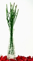
She Loves Me Notby cyanComment by rae: nice colors, the greens and reds are so vivid. i would have liked to see more of the roses on the bottom though. |
 Photographer found comment helpful. Photographer found comment helpful. |
| 11/15/2007 04:01:45 PM |
She Loves Me Notby cyanComment by rmezzo: Great idea and nice use of negative space, although it looks like you went overbard on the contrast adjustment. |
| Photographer found comment helpful. |
| 11/15/2007 01:56:21 PM |
|
| 11/15/2007 11:17:19 AM |
She Loves Me Notby cyanComment by RamblinR: Great minds think alike - just so hard to be unique these days, lol. The red, green and white are striking but the focus is rather soft (this may have been your intention though). Well done. |
| Photographer found comment helpful. |
| 11/15/2007 11:17:08 AM |
|
| Photographer found comment helpful. |
| 11/15/2007 07:52:52 AM |
She Loves Me Notby cyanComment by arron_christensen: I really like this idea, but I think the etchings on the glass are a bit distracting. Maybe a smooth glass would work better with the roses a bit more in focus |
| Photographer found comment helpful. |
| 11/14/2007 01:34:17 PM |
|
| 11/14/2007 01:24:28 PM |
|
| Photographer found comment helpful. |
| 11/14/2007 10:46:14 AM |
|
Home -
Challenges -
Community -
League -
Photos -
Cameras -
Lenses -
Learn -
Help -
Terms of Use -
Privacy -
Top ^
DPChallenge, and website content and design, Copyright © 2001-2025 Challenging Technologies, LLC.
All digital photo copyrights belong to the photographers and may not be used without permission.
Current Server Time: 04/07/2025 09:29:37 AM EDT.