| Image |
Comment |
| 08/09/2005 05:01:14 AM |
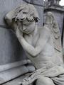
Angel.JPGby kmiller88Comment by marmalade1121: A couple of things (echoing the comment below):
1) tighter crop, get rid of some of the sky in the corner
2) once you learn it in post processing, a little blurring of the background on the right hand side, I find my eye looking to the right of the angel.
Otherwise very nice. |
 Photographer found comment helpful. Photographer found comment helpful. |
| 08/08/2005 09:05:27 PM |
Angel.JPGby kmiller88Comment by kawhona: The best shot of the three though I would crop tighter around the main subject. You might also play with the levels a bit and also do the unsharpen mask. A Gaussian blur might even be worth a try. I think you need to play with it just a bit to get the angel to pop out more. This shot has some potential though |
| Photographer found comment helpful. |
| 08/08/2005 09:03:00 PM |
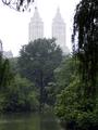
Central-Pond.JPGby kmiller88Comment by kawhona: Disclaimer first :) Please remember my opinion is worth what you are paying. I am not an expert photoshopper so you may be looking for a different kind of opinion. Finally what I find appealing may not be what you want to accomplish so follow your own inner eye. On this shot to me the sky is blown out (over exposed) that may have been what you were trying to achieve. A graduated ND filter probably could have remedied that or you can use the burn and dodge brush to reduce the contrast. |
| Photographer found comment helpful. |
| 08/08/2005 03:54:54 PM |
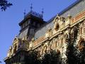
Mansard.JPGby kmiller88Comment by jbsmithana: Might be a bit more dramatic if you move the frame to the right and fill the upper right had corner with the building. You could do it with this shop with a different crop. The trees in the foreground do present a problem though. |
| Photographer found comment helpful. |
| 08/08/2005 03:52:18 PM |
Angel.JPGby kmiller88Comment by jbsmithana: Good exposure and the subject has interest. The wall behind the statue shows the horizon is off. I would line up the corner vertically even if it makes the statue lean a little more and see what it looks like. It may even take care of the sky in the upper left. If not you could clone that out. Good job overall though. |
| Photographer found comment helpful. |
| 08/08/2005 03:25:56 PM |
Mansard.JPGby kmiller88Comment by RobotBanjo: Good coloring etc, but a tad boring- you know? Looks like a beautiful building though- you probably have some great memories. |
| Photographer found comment helpful. |
| 08/08/2005 03:24:28 PM |
|
| Photographer found comment helpful. |
| 08/08/2005 03:23:25 PM |
Angel.JPGby kmiller88Comment by RobotBanjo: Very dramatic! I don't like that bit of sky in the right corner- but other than that- pretty good.
Play around with it in photoshop (or equal) and I bet you could get a really nice pic!
Very nice. |
| Photographer found comment helpful. |
Home -
Challenges -
Community -
League -
Photos -
Cameras -
Lenses -
Learn -
Help -
Terms of Use -
Privacy -
Top ^
DPChallenge, and website content and design, Copyright © 2001-2025 Challenging Technologies, LLC.
All digital photo copyrights belong to the photographers and may not be used without permission.
Current Server Time: 04/09/2025 11:03:59 AM EDT.