Shapesby
eyeronikComment by theSaj: ::: Critique Club ::: [The Saj]
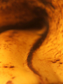
First Impressions: What is it? Okay, interesting line and a pleasant curve....where is the photographer trying to bring me? Do like the curve though....
These were my first initial thoughts. It's a very abstract photo. I am making the assumption that is what you were aiming for? In the future, it is helpful to state a little bit regarding the goals you are aiming for with regards to a photograph. Helps the critiquer out in measuring how well those were achieved.
-------------------------------------------------------------
Composition: I believe the composition for this appeals to the abstract nature quite nicely. Particularly, in how the composition provides a good emphasis of curvature along the brown line. It appears to follow similar curves as Edvard Munch's "Scream"
Subject: As the challenge topic was shape, I am not quite sure this subject was the best choice for conveying such emphasis. The line does clearly denote curvature but the overall feel of the photograph is so strongly abstract that "shape" is not what leaps up to me as a major attribute.
Technical (Colour, focus, and light): The colors in this photograph naturally work well, both are subdued earthtones so they don't leap out at you.
You've mentioned you experimented with varying DOF and did not like how the deeper DOF appeared. I believe the shallow DOF is the better choice if you were looking for a very abstract photo. And I do not believe your composition would have worked well if all was in focus as it would come across as merely a close up photograph of a banana peel.
The lighting seems to have been very natural in it's feel - that is a nice quality.
Creativity: You've created a very nice abstract image from a simple everyday object. That shows a good idea at taking advantage of what is around you.
-------------------------------------------------------------
Summary: I am left with the overall feeling of a nice abstract but a photo that seems a bit out of place in the challenge it was entered. I also feel that the image may not be strong enough to stand on it's own. (Albeit, the nice curvature line reminiscent of "The Scream" is an interesting feature.) I do see this image providing a superb backdrop for incorporation as a graphic design element. Beyond their own artistic merit, these types of abstract imagery are often needed and sought after for album covers, advertisements, etc.
To improve?:
Consider your audience, I believe this photo did not do all that well in the challenge because it was outside the scope of the audience's expectation. It may be or may have "shape" but it didn't convey the concept of "shape" the way most of DPC voters perceived. Had this been submitted in an abstract challenge such as the "Impressionist" challenge a while back - it would have done well.
Another consideration. When I first saw this image and tried to figure out what it was, I was greatly reminded of various representations of "hyperspace" I've seen in such shows as Babylon 5. It might be of interest to play with some "hue" adjustments and see how the results come out.
It is my hope that these insights are helpful, and constructive.
Message edited by author 2006-01-13 12:55:52.