Common Wealthby
rustedlightComment by SJCarter: * Greetings from the Critique Club *
First, let me say that I do remember this from the Affluence Challenge. I thought at the time that it had a lot of potential, but didn't quite realize it IMHO.
Relevance
I think that this met the challenge topic well, in that it was a fairly universal example of affluence (in the industrialized nations).
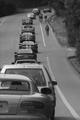
Color/Focus
I think that actually the B/W conversion hurt your shot in this particular instance. Granted, I don't know what it looked like in color, but for it to be more relative to "affluence", I envision lots of "rich" colors. The focus was also not as sharp as it could have been to create a "wow" factor.
Lighting
Lighting was fair. There's not a lot of contrast in the image - mostly made up of grays, so it's difficult to determine whether or not the lighting was as optimal as possible. Which is to say, that it obviously wasn't as good as it might have been. However, I think that the image could be improved dramatically with a little more post-processing.
Composition
I think that the composition is good. The "line" of exotic automobiles, obviously represents affluence and the crop is very condusive to envisioning an endless stream of these. The inclusion of bicyclists is another reminder of the excessive needs of the "well-to-do". You did very well here IMHO.
Overall
I think that the shot has a lot of possibilities, but that it didn't quite reach as many of them as it might have. Namely, the focus and the choice of B/W over color. I think it met the Affluence Challenge theme well, but suffered in score because of these elements.
Just my 2 cents...