| Image |
Comment |
| 10/19/2005 03:16:46 AM |
|
 Photographer found comment helpful. Photographer found comment helpful. |
| 09/27/2005 10:59:17 AM |
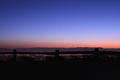
The Fence on top of the Worldby metaphoxComment by HBunch: *Critique Club*
While it is an interesting photo, like you, I'm not sure if it really screams interesting perspective. Obviously, everything is a perspective, but what i was looking for in this challenge is a perspective that added something to the subject.
The fence is barely visible in ths shot. maybe if you had a flashlight and long exposure you could have painted it by hand. That could have definately been interesting.
The colors are neat. I like the red/blue of the sky.
The lights of the city really don't add much to the photo. They seem to be too bright, or too blurry to really matter much.
So, while you have a neat sky, there's too much of a lack of detail in the city and not enough light on the fence to really work for me.
There's really no where around here where a person can go to overlook a city, so definatly not something I see every day. I'd trek up there often on good nights to experiment with different things.
~Heather~ |
| 09/20/2005 01:53:20 AM |
|
| Photographer found comment helpful. |
| 09/19/2005 04:43:20 PM |
|
| Photographer found comment helpful. |
| 09/19/2005 04:39:19 PM |
|
| Photographer found comment helpful. |
| 09/17/2005 05:31:19 AM |
|
| Photographer found comment helpful. |
| 09/14/2005 08:55:32 PM |
The Fence on top of the Worldby metaphoxComment by AzCKelly: Neat shot! I didn't score it as high as it could have been. The fence line is hard to separate from the city and mountain lines. It just blends too much where you've captured it now. What a wonderful view! |
| Photographer found comment helpful. |
| 07/24/2005 08:16:57 AM |
Texture from Texasby metaphoxComment by malenki: a very good macro, but the subject of the photo is a very common one in this challenge...however i have to admit that i kinda like your photo:). |
| Photographer found comment helpful. |
| 07/23/2005 10:07:54 AM |
Texture from Texasby metaphoxComment by HBunch: The texture is interesting in the bottom right corner. It hink though that this could use a different crop or angle. Most of the photo is made up of the background, which doesn't really add to the photo for me. The DOF is good, but to the point where I can't tell what the dark circle in the center of the photo is. It appears to be metal, since it's got a large light reflection on it, which is also distracting. If that object were meant to be in the photo, then having it in better focus might work. If it's not serving a purpose, then I think it would be better if it were not in the photo at all. Maybe hide it behind the raised part of the subject? A slightly different angle may hide it. Lighting otherwise seems ok, I like how the texture shows up in the shadow as well. ~Heather~ |
| Photographer found comment helpful. |
| 07/22/2005 06:43:14 PM |
|
| Photographer found comment helpful. |
Home -
Challenges -
Community -
League -
Photos -
Cameras -
Lenses -
Learn -
Help -
Terms of Use -
Privacy -
Top ^
DPChallenge, and website content and design, Copyright © 2001-2025 Challenging Technologies, LLC.
All digital photo copyrights belong to the photographers and may not be used without permission.
Current Server Time: 04/09/2025 01:13:29 PM EDT.