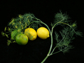
Flowering Dillby
groundbeefComment by kteach: Greetings from the Critique Club!
First Impression:
The photo is a bit small, and it took me a second to find the flowers. I like how there are several tones of yellow and green that all blend well in the shot.
Compostion/Background:
I'm undecided on the background being completely black. On one hand, I like it because it lets the colors pop more, but it also seems almost too flat. Perhaps because the dill stem is going out of the frame on the bottom? That feels a bit strange to me. I like the way the colors in the dill blend together the colors in the limes and lemons. But I think I'm still confused about why they're there exactly.
Technicals:
The lighting here is nice, looks like you did a great job with the new photo tent. Everything seems to be pretty focused, but with the small size of the photo, it's difficult to tell.
Post Processing:
I think many voters are used to seeing something closer to the full 640 pixels along at least one edge, and not taking advantage of that hurt your score. The only other thing I see is a tiny bright spot to the left of the stem which I might have cloned out since this was an advanced editing challenge.
Overall:
Not a bad shot, especially for a comeback to DPC challenges after a few months off. I'd review the rules for sizing before submitting again. Keep using that light tent though, I think it really helped out the technical aspects of this shot.
I hope you found this critique helpful. Please feel free to PM me if you have any questions.