| Image |
Comment |
| 04/16/2006 09:29:49 AM |
Liquid Chromeby chozmaComment by sabphoto: Fits challenge=5
Color/lighting=1
DOF/focus=0
Wow factor/uniqueness=0
Attractiveness=0
Nice idea and I like the way it looks like it punced a hole in the metal but it just doesn't hold my attention very long. |
 Photographer found comment helpful. Photographer found comment helpful. |
| 10/10/2005 03:13:10 PM |
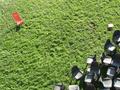
The New Kidby chozmaComment by JH: I love clever shots like this one. Nice. Not sure about that stack of something on the top right. Pity you couldn't have removed that.
edit: Meant top right, not top left. Message edited by author 2005-10-12 08:36:33. |
| 10/09/2005 06:10:33 PM |
The New Kidby chozmaComment by steve500: I love it, it makes me think chairs really do have feelings. Great composition. Awesome. |
| 10/09/2005 07:54:57 AM |
|
| 10/08/2005 09:42:38 AM |
|
| 10/08/2005 08:54:05 AM |
|
| 10/05/2005 08:06:15 PM |
The New Kidby chozmaComment by photoventurer: Great job I think most people forget what two mixed compliments make GRAY as shown in the gray chairs.....Bravo |
| 10/05/2005 11:44:43 AM |
The New Kidby chozmaComment by persimon: Needs more saturation and contrast. Nice composition. The light colored box or books (square object) in upper left is a little distracting. |
| 10/05/2005 10:46:57 AM |
The New Kidby chozmaComment by Elaine: I think the red chair should have been closer to the other chairs so there would not be so much empty space. |
| 10/04/2005 11:07:11 AM |
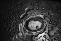
Pure bubblesby chozmaComment by karmat: CRITIQUE CLUB CRITIQUE
by karmat
Compositionally, I love the crop of this. The offset angle adds interest and dynamics to the shot and draws the viewer in. It is also infinitely more interesting than just a straight shot of a wine glass with a bubbly beverage in it.
Technically, this shot screams for sharp focus throughout. At first glance, I thought the bubbles were also out of focus, but upon closer looks, it may just be a reflection of sorts that keeps them from looking "clear." In a shot like this, where there is simply light and dark, the eye is going to be drawn to the light area, and I think that is why it needs a stronger focus on the stem and bottom of the glass. If you wanted more emphasis on the beverage, perhaps a bit more space around the top would help to pull the eyes back up.
Overall, I think this is an interesting image. I also think playing with the colors and hues to make this a straight black and white image (it seems to have a slight blue cast to it right now) would also be interesting.
best wishes in future challenges.
karmat |
| Photographer found comment helpful. |
Home -
Challenges -
Community -
League -
Photos -
Cameras -
Lenses -
Learn -
Help -
Terms of Use -
Privacy -
Top ^
DPChallenge, and website content and design, Copyright © 2001-2025 Challenging Technologies, LLC.
All digital photo copyrights belong to the photographers and may not be used without permission.
Current Server Time: 04/07/2025 07:16:45 AM EDT.