Untitledby
hartlComment by sylandrix: Greetings from the Critique Club...
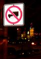
COMPOSITION... Can't really say anything bad about the composition, but at the same time there's not much going on either. I think mainly because I'd expect for the sign to say something about the environment its in... The sign seems to be just there. What's the motivation for choosing a "no trucks allowed" sign as opposed to other signs? I guess other than that, the image has the feel of a snapshot, taken from the vantage point of someone simply looking at the sign. If you explore different ways of composing your images, try to find unique angles and view points. Try getting very low, high, diagonal, putting in leading eye objects, etc. Background's not cluttered, the elements of your photo are simple and clear. I actually like the many different colors in the background, gives the photo something else interesting to look at, but I would have liked them more if they weren't blurry...see next part
TECHNIQUE... I like the fact the sign appears unusually bright, done with flash I would suspect. Really makes the subject standout. As for the buildings, they really should be sharper, and perhaps should have been exposed a bit longer, I don't know if that would have made them slightly more visible.
OVERALL... A tripod would have certainly helped here. If no tripod's around try finding some sort of support - a mailbox, fence, anything to steady your camera when taking nightshots that require a long exposure. You may have not needed a long exposure to capture the sign with your flash but I think the background could have benefitted by a steady, long exposure.