| Image |
Comment |
| 09/15/2005 08:53:20 AM |
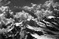
through heaven's lenseby tomzinhoComment by strangeghost: GREETINGS FROM THE CRITIQUE CLUB
by strangeghost
COMPOSITION
Airplane window shots can be a pain. You have access to some pretty incredible scenery from a great vantage point, but not much control over the details. This is a great capture under those circumstances, catching both foreground peaks with lots of detail and background mountains lost a bit in the haze of distance. Love the combination of clouds, snow and dark rock. You had great light and took full advantage of the opportunity.
TECHNIQUE
Your end result looks very good, and you achieved a very respectable score in the challenge, so your technique was obviously successful. I wonder if you really only used desat and contrast enhancement to achieve the BW effect though. If you're using photoshop, you might also experiement with channel mixer to achieve other types of BW effect. There are many, many ways to achieve the BW look, don't limit yourself to simple desat/contrast adjustments! I agree with the commenter who observed that you had achieved an Ansel Adams-type look. It catches the eye!
OVERALL IMPACT
Not many people can resist a second or third look at a compelling landscape shot, especially one with an unusual viewpoint and a sweeping grandure. You have certainly done that here. The image is eye-catching and and well composed. Not many people could pass by quickly with this pic. Nice job! Message edited by author 2005-09-15 14:37:21. |
 Photographer found comment helpful. Photographer found comment helpful. |
| 09/11/2005 11:49:34 AM |
|
| Photographer found comment helpful. |
| 09/11/2005 10:28:29 AM |
through heaven's lenseby tomzinhoComment by peridaisy: This is great! I'm new at this, so.... I really like how the clouds are drifting over the mountain tops, the contrast b/n black and white, and the dark sky, it's beautiful! |
| Photographer found comment helpful. |
| 09/11/2005 05:37:43 AM |
Diagonal & Linearby tomzinhoComment by mandyturner: *Critique Club*
WONDERFUL!!! I shouldn't be the one to give you a critique because I see no improvement needed! You hit the nail on the head with the theme on this one. The lines are awesome! The angle is perfect, maybe puch up the contrast a bit, but that is just my personal preference. I would like to see this before you desaturated it. Did it have bright colors? The colors might have given it an extra "punch". Great job! You are awesome!!
Mandy |
| 09/10/2005 08:46:25 PM |
|
| Photographer found comment helpful. |
| 09/10/2005 06:27:43 PM |
|
| Photographer found comment helpful. |
| 09/10/2005 02:03:25 PM |
|
| Photographer found comment helpful. |
| 09/10/2005 10:10:51 AM |
|
| Photographer found comment helpful. |
| 09/09/2005 08:56:45 PM |
|
| Photographer found comment helpful. |
| 09/09/2005 06:50:30 PM |
|
| Photographer found comment helpful. |