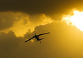
DPChallenge: A Digital Photography Contest You are not logged in. (log in or register
 
Browse Settings
Currently viewing:
Registered Usernikmatic

Show comments:

Per page:

Order:

Comments:


Comments Received by nikmatic
Pages:   ...
Showing 31 - 40 of ~255
Image Comment
ZORIA
08/15/2006 11:24:11 AM
ZORIA
by nikmatic

Comment by Thai:
like the Idea of a hand full of peas, so perfect focus on the centre, well done
Photographer found comment helpful.
ZORIA
08/15/2006 07:05:02 AM
ZORIA
by nikmatic

Comment by messerschmitt:
fine entry !
Photographer found comment helpful.
ZORIA
08/15/2006 01:26:26 AM
ZORIA
by nikmatic

Comment by Curious:
A classic rustic composition. Well executed.
Photographer found comment helpful.
ZORIA
08/14/2006 11:25:28 PM
ZORIA
by nikmatic

Comment by hotpasta:
great hands study...I like this...well done
Photographer found comment helpful.
ZORIA
08/14/2006 08:46:49 PM
ZORIA
by nikmatic

Comment by irishempress:
lovely photo -- great composition and wonderful take on this challenge. 10!
Photographer found comment helpful.
JUMP
08/11/2006 01:28:07 PM
JUMP
by nikmatic

Comment by skewsme:
only detractor is..... eewwww, crotch shot... :P
JUMP
08/09/2006 05:20:24 PM
JUMP
by nikmatic

Comment by Ragga2000:
Meets the challenge :o) Personally I would pump up the blue in the sky... t.i. more colors in the picture... but, it is a good idea and a nice photo..
Photographer found comment helpful.
JUMP
08/09/2006 04:31:53 AM
JUMP
by nikmatic

Comment by starrlite:
That could be dangerous!
Photographer found comment helpful.
JUMP
08/09/2006 04:20:06 AM
JUMP
by nikmatic

Comment by Dave Gordon:
Great action shot, and definitely from the ground shooting up.
Photographer found comment helpful.
Barrel roll
06/09/2006 04:41:23 AM
Barrel roll
by nikmatic

Comment by Konador:
Hello from The Critique Club! :)

This is a very dramatic shot that definately uses a single light source, however the challenge did require an artifical one, which the sun unfortunately is not. I think that mainly explains your low score, however I will focus on the technical aspects in this critique.

Compositionally, I feel this is slightly awkward. I feel this way because the plane is almost centered, but not quite. It's not centered enough to look like it is supposed to be, yet it is not far enough from the centre to be using the compositional rule of thirds. Either would be effective it its own way, but this "in between" feeling just feels a bit umbalanced. I think the very bright area on the right unbalances it further. I think moving the crop to the right so that both the plane and bright area were following the rule of thirds would greatly improve this photo.

I like the colour of the photo, the yellow definately giving it an added sense of drama, and making it more attractive in general. I'm not sure how much is natural or how much you altered it in the raw conversion, but its effective either way.

I think the final thing that lets this photo down a bit is the sharpening. You didn't mention it in your Photographer's comments, but I can see that you've done it because there is a white halo outlining the whole plane, which I feel is distracting. If you used Unsharp Mask, I think that you should have used a thinner radius. If you didn't use Unsharp Mask, I think you should have done :) I have a free video tutorial that covers Unsharp Mask in detail on my website at //www.konador.com/pp should you want to avoid the helo outlining in the future.

Overall, this is a good dramatic photo, which was unfortunately let down by not following the challenge description. I hope you found this critique useful :)

-Ben
Photographer found comment helpful.
Pages:   ...
Showing 31 - 40 of ~255


Home - Challenges - Community - League - Photos - Cameras - Lenses - Learn - Help - Terms of Use - Privacy - Top ^
DPChallenge, and website content and design, Copyright © 2001-2025 Challenging Technologies, LLC.
All digital photo copyrights belong to the photographers and may not be used without permission.
Current Server Time: 04/07/2025 09:30:06 AM EDT.