| Image |
Comment |
| 10/19/2006 09:06:57 AM |
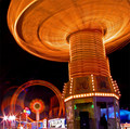
Friedby aaronwaveComment by dallasdux: Great shot of the fair. Nice use of lighting and colors. I am a little intrigued by the the swooping light in the bottom left corner. The spinning top is really cool and reminds me of a wicker basket. 9. |
 Photographer found comment helpful. Photographer found comment helpful. |
| 10/19/2006 12:32:11 AM |
|
| Photographer found comment helpful. |
| 10/18/2006 09:36:35 PM |
Friedby aaronwaveComment by Blackbox: Thanks for finding something interesting to look at. They give us the chance to use lighting, which we undoubtedley have to use in every photo and instead of being creative, most people blew it by choosing something ordinary. I'm not voting but if I was, I'd have given your photo a 10...the tilt is extra creative where I normally like level objects. |
| Photographer found comment helpful. |
| 10/18/2006 07:13:23 AM |
Friedby aaronwaveComment by alanbataar: I am a complete sucker for shooting at the fair. There's so much dynamic, saturated light to capture! Personal favorite so far! |
| Photographer found comment helpful. |
| 10/18/2006 04:15:36 AM |
|
| Photographer found comment helpful. |
| 10/18/2006 03:54:28 AM |
Friedby aaronwaveComment by Zygote: Excellent shot with great balance and movement...well planned and constructed |
| Photographer found comment helpful. |
| 10/15/2006 09:21:19 PM |
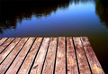
Dock Bluesby aaronwaveComment by PaulE: Greetings from the Critique Club.
Hi Aaron,
This is a technically sound shot, that really doesn't move me. I do like your choice of textured, warper wood to convey the high-contrast; and think that you have done an excellent job on the editting here. The deck however makes up less than half of your image. You have a good idea here that needs to be taken further to produce a really engaging image. A lower point-of-view (POV) may have given a more interesting perspective, or perhaps the application of some standard photographic guidelines, such as the rule of thirds and leading lines.
I have always found the following articles on composition very useful: //ronbigelow.com/articles/adv_comp/adv_comp.htm . I do not have 'the artistic eye' so I do my best to apply these concepts in the hoep that understanding of why the work will coem to me.
It is my hope that these insights are helpful and constructive. Please feel free to PM me if you have any questions regarding this critique. And please remember to mark it "Helpful" if you found it so. Good luck with future challenges.
Cheers
Paul |
| Photographer found comment helpful. |
| 10/06/2006 07:28:16 AM |
|
| Photographer found comment helpful. |
| 10/05/2006 03:57:24 AM |
|
| Photographer found comment helpful. |
| 10/04/2006 05:38:09 AM |
Dock Bluesby aaronwaveComment by nadiaC: love the blue and black. . .was kind of hoping the dock would be a little warmer (less harsh)to go along with the dark and peaceful water. |
| Photographer found comment helpful. |
Home -
Challenges -
Community -
League -
Photos -
Cameras -
Lenses -
Learn -
Help -
Terms of Use -
Privacy -
Top ^
DPChallenge, and website content and design, Copyright © 2001-2025 Challenging Technologies, LLC.
All digital photo copyrights belong to the photographers and may not be used without permission.
Current Server Time: 04/17/2025 09:40:26 PM EDT.