| Image |
Comment |
| 08/03/2005 12:56:18 AM |
|
 Photographer found comment helpful. Photographer found comment helpful. |
| 08/01/2005 02:57:49 PM |
|
| Photographer found comment helpful. |
| 08/01/2005 10:42:41 AM |
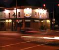
Toledo Landmarkby BikerGregComment by notonline: The tope part of the building is a little to blown out/washed out. Perhaps try a -5(-10 or somewhere about there) brightness and +5(+10 or somewhere in there) contrast should make for a nicer photo. It should make the colors pop a little more without blowning out all colors ad giving you color wash. Good luck in this challenge. <5> |
| Photographer found comment helpful. |
| 08/01/2005 07:22:28 AM |
|
| Photographer found comment helpful. |
| 08/01/2005 05:30:03 AM |
Toledo Landmarkby BikerGregComment by Jutilda: I like the movmement in the road. I wish the sign weren't so blown out, but that's what a long exposure will do with certain lighting. The perspective is good and I enjoy the overall quality of it. |
| Photographer found comment helpful. |
| 07/31/2005 07:16:12 PM |
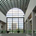
Atriumby BikerGregComment by cools98: Fit Challenge Criteria: 2/2
Color/Contrast: 1/2
Composition: 1/2
Photo Quality: 1/2
My Subjective Affinity: 0/2
This composition needs to be dead-center, instead of off ot one side. The interior lacks interesting contrast or subject, and the exterior is over-exposed. |
| Photographer found comment helpful. |
| 07/30/2005 06:48:58 PM |
Atriumby BikerGregComment by muur88: i really like how the outside building mimics the lines of the inside room. i wish the background was a bit darker. with the strong contrast between the outside and the inside window panels you could have probably done some nice looking selective leveling on it if you so chose. |
| Photographer found comment helpful. |
| 07/30/2005 07:07:04 AM |
Atriumby BikerGregComment by SandyP: Very nicely done. It's hard to get a shot like this from inside without making the outside look all blown out and the inside all dark. You did really good!!! Beautiful room too. |
| Photographer found comment helpful. |
| 07/29/2005 11:11:29 PM |
Atriumby BikerGregComment by CLarson557: Nice lines...here, I think, I would have liked to see some symmetry. It looks awkward to me. |
| Photographer found comment helpful. |
| 07/29/2005 09:22:53 PM |
|
| Photographer found comment helpful. |
Home -
Challenges -
Community -
League -
Photos -
Cameras -
Lenses -
Learn -
Help -
Terms of Use -
Privacy -
Top ^
DPChallenge, and website content and design, Copyright © 2001-2025 Challenging Technologies, LLC.
All digital photo copyrights belong to the photographers and may not be used without permission.
Current Server Time: 04/07/2025 09:33:11 AM EDT.