| Image |
Comment |
| 05/04/2005 10:08:51 AM |
|
 Photographer found comment helpful. Photographer found comment helpful. |
| 05/01/2005 03:33:26 PM |
|
| Photographer found comment helpful. |
| 05/01/2005 07:00:48 AM |
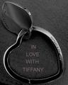
Tiffany&Co.by vivienComment by w24x192: This is a great shot but the text is distracting. Either a different choice of font or no text at all could have improved the entry. |
| Photographer found comment helpful. |
| 04/30/2005 03:47:13 PM |
Tiffany&Co.by vivienComment by kiwinick: Just a tad more space at the bottom would be better 7 the crop is a little tight IMO. |
| Photographer found comment helpful. |
| 04/29/2005 09:50:07 AM |
|
| Photographer found comment helpful. |
| 04/29/2005 04:46:09 AM |
|
| Photographer found comment helpful. |
| 04/29/2005 03:10:02 AM |
Tiffany&Co.by vivienComment by SnapperL: I wish the lighting had been more on the jewelery. It would be nice to really see it lit up. the clarity on the jewelery is nice. 6 |
| Photographer found comment helpful. |
| 04/28/2005 07:44:19 PM |
Tiffany&Co.by vivienComment by Brad: A decent composition and tone acheived here. Subtle, soft, filling the frame and well lit. (perhaps a little too tight of a crop, especially at the bottom)
Text/font used doesn't work well here as an advertisement. (5) |
| Photographer found comment helpful. |
| 04/28/2005 04:53:16 PM |
|
| Photographer found comment helpful. |
| 04/28/2005 09:45:00 AM |
|
| Photographer found comment helpful. |
Home -
Challenges -
Community -
League -
Photos -
Cameras -
Lenses -
Learn -
Help -
Terms of Use -
Privacy -
Top ^
DPChallenge, and website content and design, Copyright © 2001-2025 Challenging Technologies, LLC.
All digital photo copyrights belong to the photographers and may not be used without permission.
Current Server Time: 04/07/2025 07:13:48 AM EDT.