| Image |
Comment |
| 02/27/2005 08:36:29 PM |
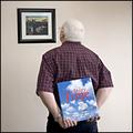
From Time to Timeby RosskoComment by JPR: This is an excellent and intriquing image and a great example of how challenge interpretations can lead to us creating images we may otherwise have never taken. 7 |
 Photographer found comment helpful. Photographer found comment helpful. |
| 02/27/2005 02:25:35 AM |
|
| Photographer found comment helpful. |
| 02/25/2005 08:52:52 PM |
|
| Photographer found comment helpful. |
| 02/24/2005 03:21:12 AM |
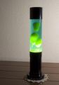
Lava Lovaby RosskoComment by Shaman: the wall and table and doily texture take away from the image, and distract the eye.. A plain background might have drawn your eye better. Nice job though. |
| Photographer found comment helpful. |
| 02/24/2005 01:05:52 AM |
Lava Lovaby RosskoComment by justinbrook: My first impression was why that background but the more I thought about it the more I remember having that stuff all through the house hehe.. |
| 02/23/2005 09:25:22 AM |
Lava Lovaby RosskoComment by saiphfire: Hot spot on right side of glass is distracting... perhaps could have blocked direct sun. Also, I'm not a fan of the doily. |
| 02/23/2005 07:49:10 AM |
|
| Photographer found comment helpful. |
| 02/22/2005 01:21:32 AM |
|
| 02/21/2005 01:08:42 PM |
Blue Bridgeby RosskoComment by bananashay: I really like the line that the curve of the bridge makes. It's very graceful. Blue might be a bit oversaturated, it stands out well, yes, but the road's taken on a bluish tint too. |
| 02/20/2005 02:04:46 PM |
Blue Bridgeby RosskoComment by vandal: I like this picture. I think that if it were mine, I would desaturate all the color except the blue on the bridge just to make it pop that little bit more....but thats me. It looks a tad bit soft, but not bad. Nice job! |
| Photographer found comment helpful. |
Home -
Challenges -
Community -
League -
Photos -
Cameras -
Lenses -
Learn -
Help -
Terms of Use -
Privacy -
Top ^
DPChallenge, and website content and design, Copyright © 2001-2025 Challenging Technologies, LLC.
All digital photo copyrights belong to the photographers and may not be used without permission.
Current Server Time: 04/09/2025 01:17:07 PM EDT.