| Image |
Comment |
| 04/15/2005 08:59:26 AM |
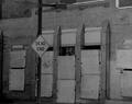
Dead Endby TobyFComment by tommyd65: Good idea. I wish the picture had a little more contrast though. The shades of gray seem to blend together rather than standing out. |
 Photographer found comment helpful. Photographer found comment helpful. |
| 04/14/2005 09:28:24 AM |
Dead Endby TobyFComment by charmayne: clearly an abondoned bldg. but kind of a bland subject without much interest |
| Photographer found comment helpful. |
| 04/14/2005 12:45:08 AM |
Dead Endby TobyFComment by Xilebo: Not much to look at here although the sign has a good meaning here... |
| Photographer found comment helpful. |
| 04/13/2005 03:54:57 PM |
|
| Photographer found comment helpful. |
| 04/12/2005 10:17:52 PM |
Dead Endby TobyFComment by sofapez: This a good image but would be better with some highlights, the tone is dim across the board so detail is lost that would make this a much better image. Cropping it square (cut the right where the object is cut in half) would draw the eyes in more. |
| Photographer found comment helpful. |
| 04/09/2005 04:15:45 PM |
Faces-of-God.jpgby TobyFComment by TobyF: Originally posted by mfairbanks:
Greetings,
Wow, the contrast between the warmth of the rock face and dwellings and the cool white of the snow is Awesome in this picture! Great shot!
Mike
//www.mikefairbanks.com |
Thanks for the comments. I appreciate it. |
| 04/06/2005 02:58:20 AM |
|
| Photographer found comment helpful. |
Home -
Challenges -
Community -
League -
Photos -
Cameras -
Lenses -
Learn -
Help -
Terms of Use -
Privacy -
Top ^
DPChallenge, and website content and design, Copyright © 2001-2025 Challenging Technologies, LLC.
All digital photo copyrights belong to the photographers and may not be used without permission.
Current Server Time: 04/07/2025 11:50:57 AM EDT.