| Image |
Comment |
| 06/24/2005 12:55:24 PM |
|
 Photographer found comment helpful. Photographer found comment helpful. |
| 06/22/2005 04:41:02 PM |
|
| 06/22/2005 02:30:36 PM |
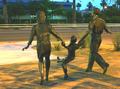
Look Both Ways...by TobyFComment by smilebig4me1x: my goal is to comment on every photo in this challenge..heres urs..good luck..i have seen these same statues in several challenges. this one need some contrast bump,and brightness taken down a bit with some yellow desats..IMHO this would greatly improve this |
| Photographer found comment helpful. |
| 06/22/2005 06:20:31 AM |
|
| 06/22/2005 03:47:30 AM |
Look Both Ways...by TobyFComment by hopelessoptimist: I think I took my photo across the street from here! I almost wandered over this way. The colors are odd. It looks like a long exposure so things are lighter than they actually were. I think a different angle would be better because the background is really busy to me. You know, I think this isn't where I thought it was. |
| Photographer found comment helpful. |
| 06/21/2005 10:56:37 PM |
Look Both Ways...by TobyFComment by Caltrop: I do not like this type of art (bronze casts of a modern family), for some reason it bugs me. Having said that it is an interesting shot |
| 04/18/2005 06:15:16 PM |
|
| 04/17/2005 06:35:17 PM |
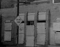
Dead Endby TobyFComment by mauidude: more contrast perhaps? it seems to have an excess of gray and midtones.
also, the abandoned building isn't easily seen since the sign is the subject. |
| Photographer found comment helpful. |
| 04/17/2005 01:53:06 PM |
Dead Endby TobyFComment by christinamtodd: I see there is some sun light at the top of the frame. It would be cool to see this same scene either a little later or earlier in the day with a beam of light across the boarded up windows or sign. I also think it would have made the image 'pop' more, giving it more contrast. Just an idea. |
| Photographer found comment helpful. |
| 04/15/2005 11:05:58 AM |
|
| Photographer found comment helpful. |
Home -
Challenges -
Community -
League -
Photos -
Cameras -
Lenses -
Learn -
Help -
Terms of Use -
Privacy -
Top ^
DPChallenge, and website content and design, Copyright © 2001-2025 Challenging Technologies, LLC.
All digital photo copyrights belong to the photographers and may not be used without permission.
Current Server Time: 04/07/2025 11:51:49 AM EDT.