| Image |
Comment |
| 08/19/2002 11:57:00 AM |
|
| 08/19/2002 07:58:00 AM |
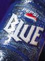
Prismacolorsby goodtimecharleeComment by rjhawkin: I knew somone was ging to take this shot. its hard to tell but it appears a bit dark, Id guess you over compensated for reflections. |
| 08/19/2002 06:57:00 AM |
|
| 08/19/2002 12:13:00 AM |
|
| 08/18/2002 03:11:00 PM |
|
| 08/17/2002 03:46:00 AM |
New Blueby goodtimecharleeComment by Martin: I hope this comes out in the uk! Excellent photo as well. Crisp and sharp. This could be used by advertisers. |
| 08/16/2002 08:01:00 PM |
New Blueby goodtimecharleeComment by Journey: This is a very nice image. It is more successful however as an artistic image than as a product image. Good composition. What I like most of all about it is the abstract shapes of the droplets in the bottom part. Like that you turned this image, except for the white lettering and the red in the logom, into a blue world. I see two flaws with it (just my photographic illiterate taste, mind you :): The pinkish/sepia shape being the right edge of the can/bottle and then it veers off on the black background. That black corner doesn't bother me but the pinkish edge shape mars for me the effect of the BLUE WORLD. It doesn't seem to "belong" there and therefore my eye is attracted to it in order to make sense out of it My mind does know it's the edge of the bottle but my eye is strictly visual and can't harmonize it with the rest of the image. The pinkish/sepia shapes of the droplets on the bottle itself though are very pleasing because they are more subdued than that defining edge. I would find this image less successful as a product image, because the water effect hides some product information (naturally and artificially flavored) and more importantly the BLUE should have been white across all the letters rather than turning sepia-ish at the u and the e. It's probably due to the macro and the cylindrical shape of the product but I find it somewhat unfortunate and doubt Pepsi would "buy" it. This is a long comment and pardon my nitpicking. 8 Journey |
| 08/16/2002 07:30:00 PM |
New Blueby goodtimecharleeComment by syamjonimi: Looks cool, blue and refreshing. It must be new because I haven't even seen this on the market in my area of the USA. Wish the lighting hadn't created that glare along the edge though. =7 syamjonimi |
| 08/15/2002 04:09:00 PM |
New Blueby goodtimecharleeComment by tee tah: I don't like to see the name of the challenge (new) used in the title... too cliche or something. There are lots of other, more creative ways to express it. I've never seen this flavor of pepsi before, so it must be NEW! Looks like it could be an advertizement! Maybe a little too much "shine" on the bottle, but overall good, and I like the water droplets... you can almost feel the icy cold. |
| 08/15/2002 12:18:00 PM |
New Blueby goodtimecharleeComment by justine: Wow haven't seen that yet! Nice photo, clean, clear, good color. Light is a bit harsh, but will score this a 7. Kee |
Home -
Challenges -
Community -
League -
Photos -
Cameras -
Lenses -
Learn -
Help -
Terms of Use -
Privacy -
Top ^
DPChallenge, and website content and design, Copyright © 2001-2025 Challenging Technologies, LLC.
All digital photo copyrights belong to the photographers and may not be used without permission.
Current Server Time: 04/17/2025 06:21:33 PM EDT.