Crisp Point Lighthouseby
hi131Comment by srdanz: ::: Critique Club :::
Hi
I am Serge from the Critique Club. The following is a critique for "Crisp Point Lighthouse".
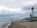
First Impression - the most important one: Wonderful photo but - what's that with the horizon? Could it be the perspective - will check later...
Composition: Very good. Rule of 3rds applied on both the horizon line and the seashore line. The lighthouse is occupying the middle 3rd of vertical space - everything is pleasing to the eye.
Subject: As this is the best of (free study) it is hard to measure how much does this one meet the challenge. From your perspective (as per your comments) it means a lot to you, so this is your most remarkable (if not the best) photo of 2005.
Technical (Colour, focus, and light): This is another place (other than the horizon that could have been straightened a bit, while leaving the lighthouse perfectly straight) where this photo did not draw all the top scores (although 5.7x is pretty good result). The lighting conditions were not perfect. What is lacking is some contrast between the sea and the sky, and the gray color of the lighthouse against the similarly gray color of the sky behind it. The lighting was very diffused, (sometimes a good thing that eliminates harsh shadows) that in this case subtracted from the photo a little bit. What could have worked is if you dodged the lighthouse to bring out more white in it.
To grow its vote? a big pet peeve at DPC is the crooked horizon. Although it is not a written requirement anywhere to have straight horizons, you WILL lose point(s) on it. That's one thing guaranteed to bring your score up.
Summary: Overall nice and appealing photo. Among 800+ entries in the best of 2005 (and I voted on all of them) I actually remembered this one. And that is something to take with you - it is a memorable photo after all.
if you have any questions on the critique feel free to PM me.
Best regards,
-Serge