| Image |
Comment |
| 09/16/2002 06:20:00 AM |
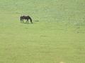
Horseby DazzermasComment by Marsha: I think this is a good representation of negative space. The picture, however, looks a bit over exposed. Perhaps some post processing could have brought the colors out a bit. |
| 09/16/2002 06:13:00 AM |
Horseby DazzermasComment by UberFish: All that space is doing is showing that there is a large distance between you and the horse. I'd prefer you to use the space to give a sense being is a expansive place, like when you get out into barren places, and the land and sky feel so big and huge. |
| 09/16/2002 04:26:00 AM |
Horseby DazzermasComment by BigSmiles: There's a little too much going on inside your negative space but it's there... |
| 09/14/2002 04:26:00 PM |
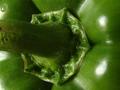
Greenby DazzermasComment by autool: Composition: Subject Placement, Cropping, Background6, Technical: Focus, Exposure, Lighting, Processing8, Appeal: Is it Interesting, Motivating, Etc.? 5, Total Averaged Rating6. Autool |
| 09/14/2002 01:00:00 PM |
Greenby DazzermasComment by jimmsp: Composition - quite good Technical Aspects - quite good Meets Challenge - yes Visual Impact / Originality � high Other suggestions � 7 Jim msp |
| 09/13/2002 09:31:00 PM |
Greenby DazzermasComment by GeneralE: I find that one drop of water a bit distracting, but I like the overall concept/execution. |
| 09/13/2002 01:47:00 PM |
|
| 09/13/2002 01:44:00 PM |
Greenby DazzermasComment by FranziskaLang: great idea. nice photo. i like the stem being cropped off like that, i'm wondering whether you are getting comments that you should have gotten all of it in the shot. the water drop in the top left distracts me a bit ... either have more, or none. this way, it looks like an oversight from washing the pepper. -- gr8photos (5) |
| 09/13/2002 09:23:00 AM |
|
| 09/13/2002 07:01:00 AM |
Greenby DazzermasComment by mci: peppers are very photogenic, i think. this is nicely done. maybe a tad underexposed, as you lose a bit of the detail in the darker shadow areas. also, that lone water drop in the upper left corner is kind of distracting. i think it would either look better totally dry or maybe even totally wet. also, maybe a slightly wider crop would show more of the pepper and add to the textures and bumps of the overall shot. good work. |
Home -
Challenges -
Community -
League -
Photos -
Cameras -
Lenses -
Learn -
Help -
Terms of Use -
Privacy -
Top ^
DPChallenge, and website content and design, Copyright © 2001-2025 Challenging Technologies, LLC.
All digital photo copyrights belong to the photographers and may not be used without permission.
Current Server Time: 04/08/2025 12:38:20 AM EDT.