| Image |
Comment |
| 02/19/2004 08:50:06 AM |
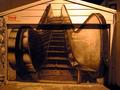
Are we going up?by tonythemonkComment by Ko Sprueone: It makes me think of a woman. I've seen this painting by standing there before. The memory of that specific location and environment may be an influence on this comment. Very warm and romantic lighting. Hmm indeed. |
| 08/11/2002 03:00:00 AM |
|
| 08/09/2002 09:43:00 AM |
|
| 08/09/2002 04:21:00 AM |
|
| 08/08/2002 04:16:00 AM |
|
| 08/07/2002 11:22:00 PM |
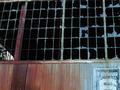
Warehouse # 6by tonythemonkComment by owennnn: The half-life of glass windows in an abandoned building is well shot here. Above average because the "something old" fills the frame, not just an object at the center of the frame like most submissions. |
| 08/06/2002 04:59:00 PM |
Warehouse # 6by tonythemonkComment by mcmurma: more of the "6" in this photo would have given it a nice anchor visually. but you would have to use a lower prespective and/or a wider angle lens cause the broken windows are the true stars of this shot. very nice. ~mcmurma Aesthetics...6 Meets Challenge...6 Overall...6 |
| 08/06/2002 03:42:00 PM |
Warehouse # 6by tonythemonkComment by autool: It is kind of nit picky but I think you should have copped a little closer on the top to get rid of the horizontal piece of trim. It stops effect of the vertical lines of the window panes. Autool |
| 08/06/2002 09:21:00 AM |
Warehouse # 6by tonythemonkComment by emorgan49: Almost nice...it bugs me when things aren't straight at the top.. and I think the other windo on the right is distracting. The colors are wonderful and the warehouse sign is great. There is an interesting shape in the least broken of windows but to me that shape would be stronger if it was offset a bit more - maybe it;s not n thirds?. |
| 08/06/2002 07:24:00 AM |
|
Home -
Challenges -
Community -
League -
Photos -
Cameras -
Lenses -
Learn -
Help -
Terms of Use -
Privacy -
Top ^
DPChallenge, and website content and design, Copyright © 2001-2025 Challenging Technologies, LLC.
All digital photo copyrights belong to the photographers and may not be used without permission.
Current Server Time: 04/09/2025 11:01:28 AM EDT.