The Winds of Timeby
devboboComment by Bear_Music: *** C I T I Q U E C L U B C O M M E N T ***
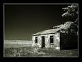
This is an exceptionally nice image, immaculately processed and rendered. There's very little I can add to the comments already received. I have two nits, both minor:
1. The border may be overpowering it a little, but I can see why youw anted "wide black". I'd like to see it with 10-15% less border. I like the way your border is a tad wider on the bottom, nice touch.
2. The image might be stronger, especially in terms of the challenge, had you very carefully selected the windmills and goosed their brightness up a little.
I'd further comment that the overlap of tree and building on the right, and the way the mass of tree is completely filling the sky upper leftish, may not be optimum here. But I cans ee you may have had no choice in the matter. I'd be curious to see a sligtly wider version of the image, to see what's over there and how it might be integrated. The trunk of the tree, perhaps?
Overall, a simply excellent picture.
Robt.