| Image |
Comment |
| 06/08/2006 02:42:09 PM |
|
 Photographer found comment helpful. Photographer found comment helpful. |
| 06/07/2006 04:30:03 AM |
|
| Photographer found comment helpful. |
| 06/05/2006 08:58:29 PM |
|
| Photographer found comment helpful. |
| 05/13/2006 09:46:11 PM |
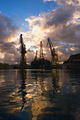
Drilling for Goldby dpdaveComment by bfox2: This is a great capture with the colors machenery reflected in the water. I think the water is my favorite part because the colors are much richer and a little bit toned down from the sky, which has that very bright highlight. If you were ever going to re-precess this as a non-challenge entry, I think it would look amazing if you combined two exposures from the raw, making one alot darker to bring some more detail back to the sky. With such a big dynamic range in the shot, though I think this did a great job. The only other thing you might do would be to crop a bit off the top. The big patch of blue leaves an open space that is a little distracting to the eye. |
| Photographer found comment helpful. |
| 05/13/2006 09:41:01 PM |
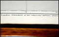
Nautically Speaking...by dpdaveComment by bfox2: I like the abstractness of this photo, and from a technical point of view it's really well done, it's well exposed and sharp. The biggest problem I think is that this is just a little bit crooked. Straightening the horizonals would have been nice. Also, as far as the challenge goes, focusing on a different part of the chart which may have been a bit more recognizeable would have been nice for the viewer. Or perhaps shooting at a higher angle so that the line you have is still the focus, but more of the chart is visible so the viewer has a better idea of what's going on. |
| Photographer found comment helpful. |
| 05/13/2006 09:25:02 PM |
IMG_0572.jpgby dpdaveComment by bfox2: Though perhaps a little bit small, I really like the composition of this shot. You might think about cropping off a little more of the right side, but I don't think that's too much of a big deal here. I really like the clouds and sky, fadeing from light to dark, as a backdrop for the belltower. On the tower itself though, I wish it were just a little bit lighter. If it were lightened up a bit I think this would really pop out at the viewer. You could also try increasing the saturation a bit to give it even more impact. |
| Photographer found comment helpful. |
| 05/13/2006 09:15:20 PM |
FW_2435.jpgby dpdaveComment by bfox2: This is a very cool shot, and seems very minimalistic as far as fireworks shots go. I really like the magenta at the bottom which compliments the blues and whites really well and the falloff from the highlights makes for a great texture. I also really like the empty space on the left and top, but theres something about the right side that's bothering me. I think cutting just a little off might make it more symmetrical with the left side, but I'm a big fan of symmetry in general which I think is the only reason it really bothers me. |
| Photographer found comment helpful. |
| 05/13/2006 09:04:35 PM |
FW_2491.jpgby dpdaveComment by bfox2: This is a lovely fireworks capture, I really like the blues traveling to pink. Great timing too, with the blue/pink on the outside, the palms inside that and the more gold burst above it all. I'm not a fan, though, of the bit of black space on the top and right side. I think if you cropped a little tighter and made the fireworks bigger in the frame it would have alot more impact. |
| Photographer found comment helpful. |
| 05/13/2006 08:53:36 PM |
Bottles_1951.jpgby dpdaveComment by bfox2: All that heiny in the photo and no nudity warning?! Gosh I'm punny, yah nevermind. Really cool shot with both the pattern and the colors with just enough imprefection to add some interest but not detract from the repetition. There are some weird lines going on on the wall on the right side though, and I can't tell if thats the way the wall is supposed to be or if you got some weird jpeg compression artifacts. Either way though, this is trill great. |
| Photographer found comment helpful. |
| 05/13/2006 08:49:56 PM |
DDG57a1.jpgby dpdaveComment by bfox2: I love the composition in this, as well as the tone and detail of the ship. I think it would be interesting to see a version of this with more saturation in the sky as suggested but to be honest I think the tones of the sky and water work really well with those of the ship. The whole image is sort of bluegray, and I think it gives a really good unity so I'm not sure brighter/more saturated colors would help it out all that much. The only thing that does sort of bother me is the buoy off the bow of the ship, which almost but not quite looks like it's connected to the ship. Just a minor distraction though. |
| Photographer found comment helpful. |
Home -
Challenges -
Community -
League -
Photos -
Cameras -
Lenses -
Learn -
Help -
Terms of Use -
Privacy -
Top ^
DPChallenge, and website content and design, Copyright © 2001-2025 Challenging Technologies, LLC.
All digital photo copyrights belong to the photographers and may not be used without permission.
Current Server Time: 04/07/2025 09:32:20 AM EDT.