| Image |
Comment |
| 01/03/2005 01:44:50 PM |
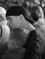
Nap before the Showby jaredldrComment by Arcanist: This is a great shot, staged or no. It oozes father son relations and the DOF does its job very nicely. Perhaps a bit too much shadow in the shoulder/chest area. This area should not be muddied as the contact would be even more solidly portrayed. The hand position around the throat looks out of place, perhaps would clone that out. For now a 7. |
 Photographer found comment helpful. Photographer found comment helpful. |
| 11/23/2004 04:10:31 PM |
|
| Photographer found comment helpful. |
| 11/22/2004 05:22:48 AM |
|
| Photographer found comment helpful. |
| 11/19/2004 06:23:45 AM |
|
| Photographer found comment helpful. |
| 11/18/2004 10:38:36 AM |
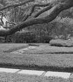
Pathwaysby jaredldrComment by damean: The texture is great, remeniscent of pointillism and very appealing. The photo lacks a definite subject, though, and feels busy. |
| Photographer found comment helpful. |
| 11/18/2004 08:21:57 AM |
Pathwaysby jaredldrComment by cghubbell: I think the perspective obscures the background path too much for this to work right. You'd want to be up about 5 more feet or so to bring it out. |
| Photographer found comment helpful. |
| 11/17/2004 10:35:39 AM |
Pathwaysby jaredldrComment by Tranquil: Interesting composition. The diagonals are pleasing. What detracts from this iamge is the fact that it is a little bit too busy. |
| Photographer found comment helpful. |
| 11/17/2004 06:55:22 AM |
Pathwaysby jaredldrComment by dipaulk: I like the way the limb goes acroos the photo and the winding pathway from front to back. The dof is good. I do think it needs a little more contrast and would have preferred a crop bove the walkway at the bottom. It tends to draw my eye down instead of into the photo. |
| Photographer found comment helpful. |
| 11/17/2004 05:42:04 AM |
Pathwaysby jaredldrComment by moodville: To me the focus of the image is the tree and having the excess length distracts a little so cropping up past the first path would put the emphasis back on the tree. The tones are all in a very similar range - likely the green - and everything seems to be in focus (instead of having a slightly blurred background), which gives the image a fairly low contrast look. Boosting the contrast a little or playing with the highlight/shadows in curves may help give the image a little more depth. It also looks a little too sharp - making your aperature wider (if possible) so some of the background was more blurred and just having the tree in sharp focus would likely help also. |
| Photographer found comment helpful. |
| 11/17/2004 05:20:16 AM |
|
Home -
Challenges -
Community -
League -
Photos -
Cameras -
Lenses -
Learn -
Help -
Terms of Use -
Privacy -
Top ^
DPChallenge, and website content and design, Copyright © 2001-2025 Challenging Technologies, LLC.
All digital photo copyrights belong to the photographers and may not be used without permission.
Current Server Time: 04/18/2025 01:31:20 PM EDT.