| Image |
Comment |
| 11/14/2004 08:10:55 PM |
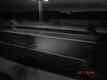
lonelyby Pictar500Comment by teknon42: this is very artistic. time stamp included. the individual elements feel a bit careless, but the image commands a strong emotional response nontheless. as a rule including a time stamp is a very very bad idea, but, due to the nature of this image, I feel that it actually contributes to this image. |
| 11/07/2004 04:11:13 PM |
lonelyby Pictar500Comment by cghubbell: Ugh... you never want the time stamp in a photographic competition - totally kills the image. |
| 11/07/2004 08:48:03 AM |
lonelyby Pictar500Comment by cpanaioti: As much as I like what I think you are trying to achieve the date is very distracting. |
| 11/07/2004 02:03:02 AM |
lonelyby Pictar500Comment by e301: Like this very much - great sense of late night road-trip, the strange emotions of travelling, the strange and enhancing views one sees from trains, busses, and the like, that never seem to present themselves at any other time. Pity about the text though, and the inevitable disqualification you'll get for that. Might you not have cloned it out, or are you making a point? |
| 11/06/2004 08:02:58 AM |
lonelyby Pictar500Comment by riotspyne: not sure what you were going for but its too hard to see what is going on here to actually get a mood from this |
| 11/05/2004 09:55:00 AM |
|
| 11/05/2004 03:23:42 AM |
|
| 11/04/2004 06:43:47 AM |
lonelyby Pictar500Comment by claudia26: evokes more depression or elusiveness than loneliness and why did you leave the data and time in this crisp orange ? |
 Photographer found comment helpful. Photographer found comment helpful. |
| 11/04/2004 02:42:22 AM |
|
| 11/03/2004 06:44:18 PM |
lonelyby Pictar500Comment by annasense: First, I think you should remove the date from being stamped on the photo... that just screams "snapshot." I'm not really sure what the title is referring to... is there a person in the background somewhere? If that's what that spec is, it really should be focused on more. Also, I think you should have either cropped out the lamp at the top completely, or included it completely. Cutting it in half just draws your attention up there and there's nothing else in the picture that pulls my eye away (except the datestamp). Lastly, I don't know if you should have used a tripod or if you were going for some sort of motion look. To me, and it's just my silly opinion, this just doesn't work well. I think it has potential, though, with a clear, in-focus subject. |
| Photographer found comment helpful. |
Home -
Challenges -
Community -
League -
Photos -
Cameras -
Lenses -
Learn -
Help -
Terms of Use -
Privacy -
Top ^
DPChallenge, and website content and design, Copyright © 2001-2025 Challenging Technologies, LLC.
All digital photo copyrights belong to the photographers and may not be used without permission.
Current Server Time: 04/12/2025 05:26:47 AM EDT.