| Image |
Comment |
| 11/30/2004 01:43:33 PM |
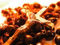
death no moreby klementComment by joebok: I like the composition and the interesting color cast, but I think there is a bit too much contrast. |
| 11/30/2004 07:52:11 AM |
|
 Photographer found comment helpful. Photographer found comment helpful. |
| 11/28/2004 02:57:53 PM |
death no moreby klementComment by KDO: I like the idea of this shot, and I like the framing. The blown out whites distract from you subject. Again, the use of space is excellent and the choice to use the rosary beads as a backdrop work very well for me. |
| Photographer found comment helpful. |
| 11/27/2004 12:42:29 PM |
|
| Photographer found comment helpful. |
| 11/27/2004 10:51:59 AM |
death no moreby klementComment by nova: Now THAT's authority. Like the shot fairly well, but the orange cast is not to my taste, a bit distracting. Love the title. |
| Photographer found comment helpful. |
| 11/26/2004 10:15:56 PM |
|
| Photographer found comment helpful. |
| 11/25/2004 12:26:34 AM |
death no moreby klementComment by Skip: the lighting and colors just do not appeal to me in this image. i can appreciate the focus and dof, but am having a hard time getting past the orange hues. |
| Photographer found comment helpful. |
| 11/24/2004 11:59:44 PM |
|
| 11/24/2004 07:16:36 PM |
death no moreby klementComment by yuorme: his face is a lil overblown... maybe a polarizer woulda helpd out some. other than lacking some sharpness, this photo is great. 5. |
| 11/24/2004 03:35:31 AM |
|
Home -
Challenges -
Community -
League -
Photos -
Cameras -
Lenses -
Learn -
Help -
Terms of Use -
Privacy -
Top ^
DPChallenge, and website content and design, Copyright © 2001-2025 Challenging Technologies, LLC.
All digital photo copyrights belong to the photographers and may not be used without permission.
Current Server Time: 04/11/2025 07:26:26 AM EDT.