| Image |
Comment |
| 09/07/2004 10:48:15 PM |
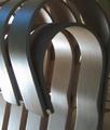
A Gehry designby maxbutenComment by Artyste: This is a great idea, but I would have liked to have seen a slight larger image, and maybe a crop that didn't cut off the second slat in the upper left. The colors seem a little desaturated as well and flat. I think if you added a little more contrast, it would help sell the lighting. |
| 09/07/2004 06:38:56 AM |
|
| 09/04/2004 02:33:38 PM |
|
| 09/04/2004 03:21:03 AM |
|
| 09/02/2004 11:18:11 PM |
|
 Photographer found comment helpful. Photographer found comment helpful. |
| 09/02/2004 06:17:49 AM |
Smith Memorialby maxbutenComment by Trinch: Granted the rule of thumb is that photographing statues from below makes them look more magnificent, but this over does it a bit too much. ;) A different angle could have strenghtened this photo. I suspect the choice was a result of needing the frame. |
| Photographer found comment helpful. |
| 09/01/2004 11:36:11 AM |
|
| 09/01/2004 07:04:19 AM |
Smith Memorialby maxbutenComment by waterlilies: I like the way the lines and vectors form a diamond in this shot. It's a unique composition, though it's hard to know where my eyes should focus. |
| Photographer found comment helpful. |
| 09/01/2004 04:51:12 AM |
Smith Memorialby maxbutenComment by Bran-O-Rama: Normally, I prefer the subjectmatter to be off-centered but I think it would help in this situation due to the diagonals formed by the building. Harsh lighting from the sky also hurts the image. I find the architecture much more interesting than the statue, thus my eyes never want to leave the foreground. |
| Photographer found comment helpful. |
| 08/31/2004 10:28:36 PM |
|
Home -
Challenges -
Community -
League -
Photos -
Cameras -
Lenses -
Learn -
Help -
Terms of Use -
Privacy -
Top ^
DPChallenge, and website content and design, Copyright © 2001-2025 Challenging Technologies, LLC.
All digital photo copyrights belong to the photographers and may not be used without permission.
Current Server Time: 04/18/2025 01:27:27 PM EDT.