| Image |
Comment |
| 11/16/2006 01:39:34 PM |
|
| 08/10/2005 12:09:20 PM |
estelleweb.jpgby AnniComment by theSaj: Shirt might be too "vibrant white" in the photo which makes the lesser contrast between the face and black border more indistinguishable. What happens if you dodge/burn the white shirt to a lesser brightness?
oooh...on a wim I decided to convert it to B&W....you should try it!
|
| 08/08/2005 12:13:22 PM |
gaweb4.jpgby AnniComment by theSaj: don't like this one, if I was the singer I don't think I'd like it either...
very harsh...clear capture but the expression says "I wasn't happy when this was taken..."
(not trying to be mean, just trying to give it as I see it - i do hope the feedback is helpful)
I'm hoping to post some new gig shots soon...
(not much point though....I posted my shots in a thread for comment and basically got zero response....quite disappointing) |
| 08/08/2005 12:11:37 PM |
gaweb.jpgby AnniComment by theSaj: a thought...something seems odd and overly distracting with those red par cans in the back....see if just de-saturating those colors could help. Or a focused de-saturation applied to just the par cans. |
| 08/08/2005 12:10:46 PM |
gaweb2.jpgby AnniComment by theSaj: I'd crop out the top lights...very distracting elements...perhaps brighten it just a touch. |
| 08/08/2005 12:08:00 PM |
gaweb9.jpgby AnniComment by theSaj: nice cute...
try a re-crop, cut out that distracting red element on the bottom. Most of the curtain to the right adds very little. Leaves me curious if cropping the whole right side out might improve the photo as well. I experimented in doing so and felt it eliminated a lot of distraction - you may or may not like the result. Perhaps post such a crop to the thread and see the feedback you get. (I even experimented cutting out the lights and focusing just on the singer.)
Nice stuff though... Message edited by author 2005-08-08 16:10:10. |
| 08/08/2005 12:06:37 PM |
gaweb11.jpgby AnniComment by theSaj: very very very nice there Anni...
much improved....about the only room for improvement with this one is the meeting of the hand & light. The light over-exposes into the hand. I bet some very careful photoshopping could weed out such imperfection.
;) |
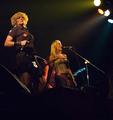
| 07/31/2005 05:29:38 PM |
Planet of Women IIIby AnniComment by theSaj: good...except i wouldn't want to meet the gal on the left in a dark alley....
good composition, good lighting....sadly the artists expression was off...i hate when that happens. |
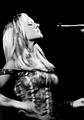
| 07/31/2005 05:26:51 PM |
Planet of Women IIby AnniComment by theSaj: :)
The gal on the left is cut off, and the fan kills the center....
Can you post a crop of just the right hand side? |
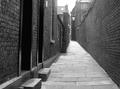
| 07/31/2005 05:25:04 PM |
|
Home -
Challenges -
Community -
League -
Photos -
Cameras -
Lenses -
Learn -
Help -
Terms of Use -
Privacy -
Top ^
DPChallenge, and website content and design, Copyright © 2001-2025 Challenging Technologies, LLC.
All digital photo copyrights belong to the photographers and may not be used without permission.
Current Server Time: 04/07/2025 06:53:02 AM EDT.