| Image |
Comment |
| 08/16/2003 06:05:44 AM |
|
 Photographer found comment helpful. Photographer found comment helpful. |
| 08/16/2003 06:02:36 AM |
|
| Photographer found comment helpful. |
| 08/15/2003 05:09:17 AM |
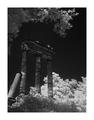
Ruinsby stephanComment by 'Pong: I like the angle and compositiona but it's been processed too much for my taste |
| Photographer found comment helpful. |
| 08/15/2003 02:59:08 AM |
|
| Photographer found comment helpful. |
| 08/14/2003 02:31:04 PM |
Ruinsby stephanComment by amsmyth: for me the amount of white (leaves lower right) detracts and I wonder why the whole image is so dark |
| Photographer found comment helpful. |
| 08/13/2003 08:25:39 PM |
|
| Photographer found comment helpful. |
| 08/13/2003 08:16:07 AM |
Ruinsby stephanComment by tyrkinn: The subject (ruins) almost disappear in the sky. Maybe channel mixer in PS could have done better to bring some contrast between the ruins and the sky. Looks spooky |
| Photographer found comment helpful. |
| 08/13/2003 07:00:04 AM |
|
| Photographer found comment helpful. |
| 08/12/2003 09:15:04 PM |
Ruinsby stephanComment by mtreit: Really nice picture, but I think the huge, light-colored border hurts it. |
| Photographer found comment helpful. |
| 08/12/2003 07:06:08 PM |
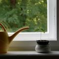
Under Constructionby stephanComment by karmat: CRITIQUE CLUB CRITIQUE
by karmat
I did not vote in this challenge, because of time issues, but I think you have done an excellent and creative job of meeting the challenge. I guess my only beef would be that it wasn't really "in" the garden, but other than that, I think it is an awesome idea.
I do think the reflection detracts a little. At first it didn't bother me, but as i looked at it, my eyes began to cross and it was like part of the picture was out of focus (not the deliberately out of focus part,). I like that the plant is so well lit and visible in front of the blurry greenery outside. It would have been neat to have a cityscape behind it, but I guess we can't have everything.
Something about the shadowed part across the bottom makes it feel unbalanced to me. Perhaps if it were cropped so that just the shelf, and not the shadow were showing this could be helped OR give just a bit more room on the right.
Good work and best wishes to you in future challenges.
karma |
| Photographer found comment helpful. |
Home -
Challenges -
Community -
League -
Photos -
Cameras -
Lenses -
Learn -
Help -
Terms of Use -
Privacy -
Top ^
DPChallenge, and website content and design, Copyright © 2001-2025 Challenging Technologies, LLC.
All digital photo copyrights belong to the photographers and may not be used without permission.
Current Server Time: 04/07/2025 08:53:30 AM EDT.