| Image |
Comment |
| 11/04/2005 03:38:14 PM |
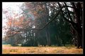
Picnic in Cathedral Parkby ElemmennopeComment by Jammur: I can understand the DNMC remarks.
Beyond that, there are a few elements which a painter would of omitted, the telephone pole and the whatever in the last archway.
The other problem I see is that in B&W the tonal range of the second acrh blends into the trees to much for me.
I find I always want to see the color version. Let me add great eye. This is the type of shot I really like to see. |
 Photographer found comment helpful. Photographer found comment helpful. |
| 11/04/2005 03:29:38 PM |
Picnic in Cathedral Parkby ElemmennopeComment by wavelength: I still think this is a great photo, I believe if you had entered this in anything but Ground UP, it would have done fantastically.(top 10 in perspective) I think the fact that you scored pretty decently even though so many said DNMC show that this is a great photo, and most people thought that also. Some people are pretty strict on the interpretation of challenges, something to keep in mind when entering I guess. Your given score means nothing about the quality of the photo. It stands on it's own as a great picture. |
| Photographer found comment helpful. |
| 11/04/2005 03:20:20 PM |
Picnic in Cathedral Parkby ElemmennopeComment by UNTITLED: I agree with Digitalknight, this is a terrific photo. I think there are a great many elements to be discovered if you take the time. My favorite is the repeating arches, each inside of the next. The picnicing couple in the photo. This one I really can't offer any improvement critiques. One reason this probably didn't score higher is that voters were looking for photos with an exaggerated upward perspective. It meets the challenge in my opinion, its from the ground up and has dramatic effect. |
| Photographer found comment helpful. |
| 11/02/2005 04:58:36 AM |
Champoeg Oakby ElemmennopeComment by UNTITLED: Like the contrast of the leaves and branch against the darker trees of the background. I wish there was more dark area and less sky towards the end of the branch. Very nice photo, regardless. |
| Photographer found comment helpful. |
| 10/18/2005 01:03:45 PM |
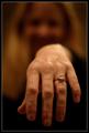
Two Carats!by ElemmennopeComment by sglantz: I like the premise but I would have prefered that the face be in focus so we can really see the pride. |
| Photographer found comment helpful. |
| 10/15/2005 04:04:19 PM |
Two Carats!by ElemmennopeComment by Jammur: 2nd look- Its pride, just wish it wasn't dull. I want my girl's ring to sparkle.
(she makes me clean every week) Got to drop it to a 6, sorry |
| Photographer found comment helpful. |
| 10/15/2005 02:39:22 PM |
Two Carats!by ElemmennopeComment by aquarian11: I gave this a six but would have preferred to see her hand on the intended's chest
or most anywhere at a different angle. Just my humble opinion. |
| Photographer found comment helpful. |
| 10/15/2005 10:03:54 AM |
|
| Photographer found comment helpful. |
| 10/15/2005 06:19:57 AM |
|
| Photographer found comment helpful. |
| 10/14/2005 06:20:17 PM |
|
| Photographer found comment helpful. |
Home -
Challenges -
Community -
League -
Photos -
Cameras -
Lenses -
Learn -
Help -
Terms of Use -
Privacy -
Top ^
DPChallenge, and website content and design, Copyright © 2001-2025 Challenging Technologies, LLC.
All digital photo copyrights belong to the photographers and may not be used without permission.
Current Server Time: 04/07/2025 09:28:47 AM EDT.