| Image |
Comment |
| 07/14/2004 03:21:09 PM |
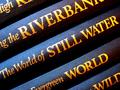
A Rich Tapestry of Wordsby DianaBComment by gajmaj: Great image from a simple subject. The lighting really works to create nice contrast and shows the texture of the books well (9) |
 Photographer found comment helpful. Photographer found comment helpful. |
| 07/14/2004 02:49:30 PM |
|
| Photographer found comment helpful. |
| 07/14/2004 12:44:01 PM |
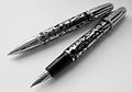
'Stypens' - For Stylish Writersby DianaBComment by DianaB: FAO: Goodman (in case you check back to find out where to get a Stypen). These were bought at Malaga airport some time ago. Sorry, but I don't know where you would buy them normally - maybe you know some good pen shops? |
| 07/14/2004 12:43:32 PM |
|
| Photographer found comment helpful. |
| 07/14/2004 12:14:48 PM |
'Stypens' - For Stylish Writersby DianaBComment by DianaB: Was 'tickled pink' (that means I'm pleased) to get within the top 50. The pens were laid on writing paper with a 'grainy' surface, which may help to explain some of the graininess of the photo? I expect my levels of 'unsharp' caused the grainy look on the pens - though I quite liked the effect myself.
Wanted, originally, to post in colour but there was a small red reflection on the fountain pen, which I knew would cost me some points. Desaturation to B&W, I thought, worked well for the challenge. I still have a lot to learn about photography though and being active on this site helps me to look at my photos more objectively. Special thanks for all the comments and suggestions that people take the time and effort to make. Thank you. |
| 07/13/2004 04:21:27 PM |
|
| Photographer found comment helpful. |
| 07/13/2004 09:57:52 AM |
|
| Photographer found comment helpful. |
| 07/12/2004 06:37:09 AM |
|
| Photographer found comment helpful. |
| 07/11/2004 10:59:35 AM |
|
| Photographer found comment helpful. |
| 07/11/2004 01:34:58 AM |
|
| Photographer found comment helpful. |
Home -
Challenges -
Community -
League -
Photos -
Cameras -
Lenses -
Learn -
Help -
Terms of Use -
Privacy -
Top ^
DPChallenge, and website content and design, Copyright © 2001-2025 Challenging Technologies, LLC.
All digital photo copyrights belong to the photographers and may not be used without permission.
Current Server Time: 04/08/2025 06:14:29 PM EDT.