DPChallenge: A Digital Photography Contest You are not logged in. (log in or register
 
Browse Settings
Currently viewing:
Registered UserChefboz

Show comments:

Per page:

Order:

Comments:


Comments Received by Chefboz
Pages:   ...
Showing 41 - 50 of ~209
Image Comment
MOTH
05/04/2005 12:56:20 PM
MOTH
by Chefboz

Comment by Pedxer:
First macro shot of the series +3 Points...beautiful focus +2 points... moth not colorful enough -1 Point.. use of reflections +2 Points...Expression on moth's face more pensive than bored -1 Point. Im sure you let the moth go after this so +3 PETA points. 8
MOTH
05/04/2005 10:56:42 AM
MOTH
by Chefboz

Comment by Mr_Pants:
I don't know what it is, but there seems to be a 'haze' over this picture.
MOTH
05/04/2005 06:28:15 AM
MOTH
by Chefboz

Comment by jaaad:
great picture of a moth, nice capture
MOTH
05/04/2005 05:39:50 AM
MOTH
by Chefboz

Comment by mimid:
This is just incredible....
MOTH
05/04/2005 05:25:13 AM
MOTH
by Chefboz

Comment by jockselwyn:
Fantastic crisp image.
MOTH
05/04/2005 02:17:30 AM
MOTH
by Chefboz

Comment by Uecker:
how very cool. Nicely done.
MOTH
05/03/2005 10:39:57 PM
MOTH
by Chefboz

Comment by Toniann220:
Yucky!! i hate those moths ....REALLY nice shot tho nice macro
Photography Then & Now
02/08/2005 09:27:42 AM
Photography Then & Now
by Chefboz

Comment by Bear_Music:
*** C R I T I Q U E C L U B C O M M E N T ***

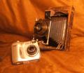
Speaking of this as a photograph (as opposed to a challenge entry) one immediately notices 3 things; it's out of focus or softened too much, the color cast is way warm, and the background dominates the image. All of these are unnatural looking components of the image, and taken together make it not work very well.

The choice of BG color is also questionable, as it too-closely matches up with the colors on the old camera's leather casing.

Speaking of this as a challenge entry, I'd comment that all of the above caused the image to be downgraded in score, and it wasn't helped by the fact that it was only one of many "old v new" camera shots.

Assuming you had wanted to continue with this theme, and interesting approach to take might have been to split the background diagonally frum upper left to lower right and have an "old" and a "new" background also, perhaps one shiny and the other like the one you chose, but a different color.

Overall, it seems a failed image, basically, soft and static with most of the attention grabbed by the overly complex BG.

Robt.
Photography Then & Now
02/01/2005 06:36:34 AM
Photography Then & Now
by Chefboz

Comment by Pano:
too soft for my liking
Photography Then & Now
01/31/2005 10:35:20 PM
Photography Then & Now
by Chefboz

Comment by sniper:
Several people come up with the same idea. Some take a little further with just a little more composition work, as you have done here. Yours was one of the few that wasn't just a couple of cameras in the same picture.
Pages:   ...
Showing 41 - 50 of ~209


Home - Challenges - Community - League - Photos - Cameras - Lenses - Learn - Help - Terms of Use - Privacy - Top ^
DPChallenge, and website content and design, Copyright © 2001-2025 Challenging Technologies, LLC.
All digital photo copyrights belong to the photographers and may not be used without permission.
Current Server Time: 04/07/2025 09:27:02 AM EDT.