DPChallenge: A Digital Photography Contest You are not logged in. (log in or register
 
Browse Settings
Currently viewing:
Registered UserCocoCoco

Show comments:

Per page:

Order:

Comments:


Comments Received by CocoCoco
Pages:  
Showing 31 - 38 of ~38
Image Comment
Praise the bridge that carried you over
05/27/2015 06:57:35 PM
Praise the bridge that carried you over
by CocoCoco

Comment by smudgeSMJ:
Great angle and composition!
Photographer found comment helpful.
Praise the bridge that carried you over
05/27/2015 03:32:56 PM
Praise the bridge that carried you over
by CocoCoco

Comment by BrennanOB:
Great heft and drama with perhaps a bit too much contrast. The underside of the bridge and the buildings could have used some more middle grays. Top 5
Photographer found comment helpful.
Praise the bridge that carried you over
05/27/2015 07:13:47 AM
Praise the bridge that carried you over
by CocoCoco

Comment by caba:
Should do well, top 5
Photographer found comment helpful.
Praise the bridge that carried you over
05/27/2015 03:17:37 AM
Praise the bridge that carried you over
by CocoCoco

Comment by Pangurban:
I like that this is in B&W.
Photographer found comment helpful.
Namastè
05/12/2015 05:59:11 PM
Namastè
by CocoCoco

Comment by Neat:
That is one serious scar, and look on his face, bumping up.
Namastè
05/06/2015 06:13:34 PM
Namastè
by CocoCoco

Comment by VBW:
I'm not a fan of selective desat, but putting that aside while grading today. Instead, I'm grading overall composition and whether i feel like the item that is colored draws my interest or if i feel like it pulls my interest away from something else that i find more personally meaningful in the picture.

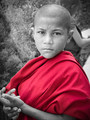
Let me say first that i love this shot- hate the selective desat.

The boy's posture, gesture and that look! What a photograph. That scar- it all draws me in. The boys in the background are a bit distracting. But that is a big nit pick- as I didn't even notice them till I started to study the picture further and thought to look to see what the background was. Even now, knowing they are there, my eyes are drawn back to the boy.

Overall I think this would work much better as a full b/w. I find myself wondering what the color of his clothing is suppose to mean/ represent and My only guess is that perhaps it is the color an order of monks wears.

So i'm not fond of that being highlighted, as I think I could have hazard a guess that he was a monk without any color in the shot. And, unfortunately, the color is a bit distracting in this shot. Would love to see this worked as a full b/w.
Photographer found comment helpful.
Namastè
05/06/2015 07:40:05 AM
Namastè
by CocoCoco

Comment by Mike:
ok
Photographer found comment helpful.
Greener than green
04/17/2015 07:29:08 AM
Greener than green
by CocoCoco

Comment by VBW:
What I like:
- Vibrant colors.

What I don't like:
- The horizon is in the center of the frame- making for competing subjects

Overall:
- I'm not a big landscape person, so take this review with a grain of salt. But I find the sky more dynamic and interesting than the land and wish the camera had been pointed a bit more up. That, of course, would lesson the adherence to the theme. With the lines formed from the grass running up the building- I wonder if this would have been a bit more dynamic (for the land) if the photographer had turned more towards 2 o'clock- allowing the lines in the grass to flow towards the building more directly- and chop out more of the sky.
Photographer found comment helpful.
Pages:  
Showing 31 - 38 of ~38


Home - Challenges - Community - League - Photos - Cameras - Lenses - Learn - Help - Terms of Use - Privacy - Top ^
DPChallenge, and website content and design, Copyright © 2001-2025 Challenging Technologies, LLC.
All digital photo copyrights belong to the photographers and may not be used without permission.
Current Server Time: 04/07/2025 11:54:40 AM EDT.