| Image |
Comment |
| 04/01/2004 03:04:12 AM |
Slurpiesby RtwoComment by muckpond: great patterns here. tighter cropping on top might have made it better (so you can't see the edge of the table or whatever) |
 Photographer found comment helpful. Photographer found comment helpful. |
| 03/31/2004 08:17:51 PM |
Slurpiesby RtwoComment by boomer: Fantastic! Great symmetry, wonderful colors, and a very creative shot. I would have cropped about a half inch off the top to get rid of the black background, and about a quarter inch off the bottom to get rid of the edge of that one yellow slurpee. But those are nits. Very festive picture! |
| Photographer found comment helpful. |
| 03/31/2004 07:29:32 PM |
|
| 03/29/2004 12:17:18 PM |
Orange Is For Dummiesby RtwoComment by LoudDog: I guess technically it's not bad, but I don't think orange when I look at it, I just think dumb. It's not at all artistic or creatively composed. |
| 03/27/2004 01:25:43 PM |
TIME MAGAZINEby RtwoComment by banmorn: no text....no pictures of text? hmmmm....no artwork.....does that include your own mockup? think you may have missed the point......the image of the very handsome lady is fine, great smile, but think more saturation might have been used, she looks a bit washed out. |
| Photographer found comment helpful. |
| 03/27/2004 02:54:18 AM |
|
| 03/26/2004 08:40:56 PM |
Orange Is For Dummiesby RtwoComment by AmiYuy: I really would have prefered a tighter horizontal crop, maybe just "The Internet" through "Office 200_" to remove the two signs on top. The color seems off though, since I own some dummies books, I can vouch for their being yellow and not orange, so that doesn't sell me on this picture at all. Score: 4 |
| 03/26/2004 10:21:03 AM |
|
| 03/26/2004 08:06:01 AM |
|
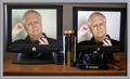
| 03/26/2004 01:45:01 AM |
Puzzled!by RtwoComment by unknowndeath: The effect is like stero vision but you don't have them close enough and the colors and montior position is to far off to pull it off. Oh well nice try. |
Home -
Challenges -
Community -
League -
Photos -
Cameras -
Lenses -
Learn -
Help -
Terms of Use -
Privacy -
Top ^
DPChallenge, and website content and design, Copyright © 2001-2025 Challenging Technologies, LLC.
All digital photo copyrights belong to the photographers and may not be used without permission.
Current Server Time: 04/07/2025 11:51:44 AM EDT.