| Image |
Comment |
| 07/30/2009 07:30:47 AM |
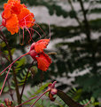
Circle of Life by stfleckComment by kmusser: I really like this one. The colors are just great and the sequence of life to death that you captured is wonderful. Clarity is a little off and some soft light would have really made this one pop. |
 Photographer found comment helpful. Photographer found comment helpful. |
| 07/29/2009 07:11:53 PM |
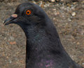
Eye on youby stfleckComment by karmat: CRITIQUE CLUB CRITIQUE
Compostionally, I think you have filled the frame nicely. It gives a nice close up view of the bird. This kind of shot would work well for a documentary type purpose, more than art. Not that either is more valuable or "better" than the other, but they are definitely different.
Technically, the focus is just a hair soft and this close that is very obvious. It could have been any number of things, but in looking at your settings, I would suggest a smaller aperture number (f/8 or 11, maybe) and this would allow you to "speed up" your shutter speed by a couple of stops. This may have let the focus be a bit sharper. The dof is good, and the lighting isn't dramatic, but it is nice and even and that helps.
Overall, it is technically an okay photo, but it feels like it just comes up a bit short. There is nothing that really grabs the viewer and draws him in or makes him compelled to stay with this shot, though the bird does look a touch surprised, if that is possible. More context, or using negative space (a personal favorite of mine, whether effective or not is totally up to you >grin<) may have helped add that little bit of interest that would take this shot up the ranks a bit.
Best to you in future challenges.
Karma
PS -- Something that *might* prove to be effective is to look at the third place picture and yours side by side and do a honest self-evaluation about what make that one better than yours. The pose is nearly the same. This distance is very similar, etc. You had the potential with this "pose," but some of the technicals dropped you down, I think. Message edited by author 2009-07-29 23:17:29. |
| Photographer found comment helpful. |
| 07/29/2009 01:19:07 PM |
Circle of Life by stfleckComment by Seraphemme: Great colors. I like the motion from top to bottom, left to right, front to back. This picture moves. Though I think the background could be blurred a bit more to really bring the subjects to the forefront. |
| Photographer found comment helpful. |
| 07/29/2009 11:50:41 AM |
|
| Photographer found comment helpful. |
| 07/28/2009 09:39:17 AM |
|
| Photographer found comment helpful. |
| 07/28/2009 06:57:59 AM |
Eye on youby stfleckComment by mgsmith53: O.K. The center of interest is the eye, and it's not as sharp as the feather texture. Maybe hit the eye with tight sharpening tool, and with a dodge to bring out the color. |
| Photographer found comment helpful. |
| 07/24/2009 12:19:53 PM |
|
| Photographer found comment helpful. |
| 07/24/2009 07:12:34 AM |
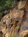
BASALTby stfleckComment by macrothing:  Critique Club Critique
First Impressions
Critique Club Critique
First Impressions
Nice showcase of the colors of this rock, I like how you've shown it in context, in situ.
Photograph Information, Technicals & Composition Review
640 would have been better, if the quality was there. A more refined crop at the bottom to eliminate the green foliage. Given the predominantly square shaped rocks in this, I think a square framing/crop would have likely enhanced the subject and image. The OOF (out of focus) fore bottom right detracts, but fairly minor - a deeper DOF (depth of field) might have eliminated that and also showcased more texture in the rocks as well.
The purple colored section on the right, throws the overall balance out slightly, so perhaps paying attention to that when choosing where to crop may have helped refine the image even further.
Comments, Score & Placement Review
69/82? - hmm, the colors grabbed people's attention, but I guess the scene didn't hold their interest long enough.
Summary
I think the potential is there with the image as is (quality pending), but a more refined crop and some tweaking in pp is needed to bring it to life more. Good meet of the Challenge. |
| 07/23/2009 10:23:53 AM |
Eye on youby stfleckComment by Timosaby: I would have liked to see more sharpness in the pigeons eye and beak area, Just a suggestion - i don't know what your intentions are - but have you tried using an unsharp mask filter + layer mask? |
| Photographer found comment helpful. |
| 07/22/2009 06:21:35 AM |
Eye on youby stfleckComment by Haneck: the composition here doesn't really capture my attention... perhaps a different angle or a more interesting crop might help out. Also the colors and contrast seem a bit dull to me, but I'm not sure how that could be fixed. Nice close-up though! :) |
| Photographer found comment helpful. |
Home -
Challenges -
Community -
League -
Photos -
Cameras -
Lenses -
Learn -
Help -
Terms of Use -
Privacy -
Top ^
DPChallenge, and website content and design, Copyright © 2001-2025 Challenging Technologies, LLC.
All digital photo copyrights belong to the photographers and may not be used without permission.
Current Server Time: 04/07/2025 09:34:58 AM EDT.