| Image |
Comment |
| 03/18/2006 11:48:33 PM |
|
| 03/16/2006 06:26:06 AM |
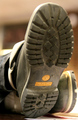
Urban Climbby MattBL34Comment by GrayGhost: This composition makes the upper part dominant, but this fights against the shallow DOF for the Timberland label. Would probably be better to give up on the shallow DOF, use more DOF to get the whole sole sharp, crank up yellow/saturation to make the label stand out. |
| 03/15/2006 01:49:34 AM |
|
| 10/25/2005 02:12:07 PM |
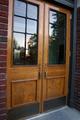
Do you have the time?by MattBL34Comment by tpoc: ...no, but the door does! : )
i wish that reflection were more prominent in the photo. as the photo currently stands, the door really calls for my attention visually. |
 Photographer found comment helpful. Photographer found comment helpful. |
| 10/20/2005 10:05:08 AM |
|
| Photographer found comment helpful. |
| 10/16/2005 03:59:47 PM |
|
| 10/12/2005 06:42:14 PM |
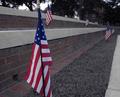
Red, White and, Blueby MattBL34Comment by nephoto: i think this picture would have been better represented on a sunny day, or time of day when more light was available to be directed at the flags themselves. as it stands the image looks more dismal than proud, and the flags don't have that snap to them that this picture could provide with better lighting. |
| 10/12/2005 12:25:45 AM |
|
| 03/22/2004 05:52:49 AM |
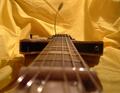
Parallel Stringsby MattBL34Comment by nymsa: good idea. the lines draw me right into the image. there's a bit too much blur at the bottom of the frame which i find distracting, though. |
| Photographer found comment helpful. |
| 03/22/2004 03:19:31 AM |
|
| Photographer found comment helpful. |
Home -
Challenges -
Community -
League -
Photos -
Cameras -
Lenses -
Learn -
Help -
Terms of Use -
Privacy -
Top ^
DPChallenge, and website content and design, Copyright © 2001-2025 Challenging Technologies, LLC.
All digital photo copyrights belong to the photographers and may not be used without permission.
Current Server Time: 04/09/2025 03:48:01 AM EDT.