| Image |
Comment |
| 04/27/2005 06:01:13 PM |
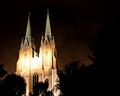
Guiding Lightby brett2004Comment by bhowie: I'm sure some will score low simply because of size. I don't mind this, but I am concerned about the blown out highlights in the centre. Better exposure would have scored an extra 1-2 points in my mind. Definately worth going back to reshoot - lovely structure and could have some cracker colouring - I'd also aim to shoot just a touch earlier and get some more complimentary colours in the sky. |
 Photographer found comment helpful. Photographer found comment helpful. |
| 04/27/2005 02:42:42 PM |
|
| Photographer found comment helpful. |
| 04/27/2005 01:20:02 PM |
|
| Photographer found comment helpful. |
| 04/27/2005 12:38:23 PM |
Guiding Lightby brett2004Comment by eqsite: The subject takes up a bit too much of the frame for me. Also, the highlights on the building seem a little too harsh. |
| Photographer found comment helpful. |
| 04/27/2005 10:00:21 AM |
|
| Photographer found comment helpful. |
| 04/27/2005 06:29:34 AM |
|
| Photographer found comment helpful. |
| 04/27/2005 02:51:24 AM |
|
| Photographer found comment helpful. |
| 11/05/2004 07:10:44 AM |
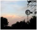
Morning Lightby brett2004Comment by Philos: Just a little tip (works for more then just this picture)
Open in Photoshop (I use CS so I don't know if this works or not)
Press the three buttons Ctrl ALT ~ (the ~ is left from the 1 key)
Up the contrast with 60%
Deselect.
Look at your picture again. Just tell me what you think. |
| Photographer found comment helpful. |
| 11/04/2004 02:16:28 AM |
Morning Lightby brett2004Comment by redmoon: it's a good silhouette type picture, but for me, isn't too exciting. i think the quantity of bushes etc is a little overpowering, and i think that maybe the sky could do with a bit of emphasising enhancing the dark and light areas (if you have Photoshop, try using curves, failing that play with brightness and contrast of the sky in whatever software you have got). 4. |
| Photographer found comment helpful. |
| 09/28/2004 06:13:46 PM |
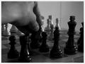
A Night's Advanceby brett2004Comment by graphicfunk: Interesting shot and very well cropped, however, I would have done it with the lighter pieces while employing the identical light. It would have aided in the definition of the Knight. Bumping up on composition. |
| Photographer found comment helpful. |
Home -
Challenges -
Community -
League -
Photos -
Cameras -
Lenses -
Learn -
Help -
Terms of Use -
Privacy -
Top ^
DPChallenge, and website content and design, Copyright © 2001-2025 Challenging Technologies, LLC.
All digital photo copyrights belong to the photographers and may not be used without permission.
Current Server Time: 04/07/2025 11:50:39 AM EDT.