| Image |
Comment |
| 03/21/2004 03:09:48 PM |
|
| 02/01/2004 09:43:21 PM |
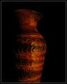
Painted Vaseby cshepComment by tfarrell23: Believe Me... you got nice comments...the Challenge was hard in the respects that there were 2 concepts...#1.... the exact... point and shoot.. with light moving... and the #2.... in- Camera aperture...time assisted shutter speed...lol..I can go on and on....digital photography..is it a photo ? or is it Art.. ?.... lol... I did the previous.... (moving)... alot of better photogs... used their Camera knowing it... to do great things..... |
| 02/01/2004 08:51:36 PM |
Painted Vaseby cshepComment by leaf: i gave it a 5.. which i feel is sort of an average vote. The black background was a good choice, but it didn't really stir up any emotions or thoughts inside of me. I am not sure what i would have done differently.. or how i would have painted it different... but it looked like a vase with light flashed on it... as apposed to a picture that created thought, or intrigue or reflection, or just a nice combination of shapes and colors...
maybe (not saying that i know).. but maybe if you had higlighted the rim quite bright... then left the neck quite dark... and then highlighted the pattern area on the widest part, then let it get slowly darker as it went lower. With the painting with light theme you could illuminate this object quite creativly. Right now it is illuminated in the same stile as if there was a single light source from the frong right..... just some thoughts... take them with a grain of salt. |
| 01/29/2004 11:28:39 PM |
Painted Vaseby cshepComment by train: I dont know how to vote on this subject but I think this is very nice maybe a little more light needed but Great warm tones |
 Photographer found comment helpful. Photographer found comment helpful. |
| 01/27/2004 08:32:39 AM |
Heartland Morningby cshepComment by brandonarbini: Why two people have said the bright spot is on the top left, I don't know? But I must say that the bright spot looks like it was added after the picture was taken. Whether it was or not, it is a little distracting. A more even light distrobution would be preferred. Good shot. |
| Photographer found comment helpful. |
| 01/27/2004 07:37:00 AM |
Painted Vaseby cshepComment by jenesis: Very very pretty. I really like the dark tones here and the texture of the vase against the black background. Very nice composition. |
| Photographer found comment helpful. |
| 01/26/2004 08:54:58 PM |
|
| Photographer found comment helpful. |
| 01/26/2004 07:46:11 AM |
Painted Vaseby cshepComment by KarenB: I would prefer to see the entire vase, or a portion of the detail. The way the bottom is cut off gives a sense of incompleteness.
The lighting is done beautifully. |
| Photographer found comment helpful. |
| 01/25/2004 03:09:15 PM |
|
| Photographer found comment helpful. |
| 01/24/2004 12:02:27 AM |
Heartland Morningby cshepComment by Harz_Joerg: Nice warm colours and well composed. I think that it is a little to dark and the bright upper left does not look too natural to me. |
| Photographer found comment helpful. |
Home -
Challenges -
Community -
League -
Photos -
Cameras -
Lenses -
Learn -
Help -
Terms of Use -
Privacy -
Top ^
DPChallenge, and website content and design, Copyright © 2001-2025 Challenging Technologies, LLC.
All digital photo copyrights belong to the photographers and may not be used without permission.
Current Server Time: 04/07/2025 07:06:54 AM EDT.