| Image |
Comment |
| 06/04/2013 07:55:40 AM |
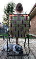
Sittin' on the Deckby thereeceshowComment by Yandrosxx: This could have been a much stronger image in a different location. The background elements are very distracting, especially the grill. But the idea is strong. |
| 06/03/2013 07:27:36 AM |
|
| 06/02/2013 06:03:56 PM |
|
| 06/02/2013 02:49:12 PM |
|
| 05/31/2013 08:00:52 PM |
|
| 05/31/2013 06:46:11 AM |
|
| 05/28/2013 04:18:20 AM |
|
| 02/04/2013 03:43:43 AM |
Central Parkby thereeceshowComment by giantmike: I really like the composition you chose here. The lines work nicely together.
It's just too bad the saturation is bumped up so high. |
| 02/03/2013 10:58:01 PM |
Central Parkby thereeceshowComment by Guyzy: I am not sure I am the best person to critique your work.
So with the greatest respect it maybe looks a little over saturated with maybe a tweak needed in the brightness and / contrast.
Nice shot though.
Is it Central Park ? |
| 02/03/2013 03:10:07 PM |
|
Home -
Challenges -
Community -
League -
Photos -
Cameras -
Lenses -
Learn -
Help -
Terms of Use -
Privacy -
Top ^
DPChallenge, and website content and design, Copyright © 2001-2025 Challenging Technologies, LLC.
All digital photo copyrights belong to the photographers and may not be used without permission.
Current Server Time: 04/07/2025 09:49:56 AM EDT.