| Image |
Comment |
| 09/11/2015 07:55:35 AM |
IR Relaxationby frateComment by sidpixel: *Hello from Sid and the Critique Club*
An excellent image that is assumed to meet the challenge.
Infra red is usually interesting but doesn't always work well with everything but it is here. Those lovely rich blues of the sky are amazing and working well against that bleached beach and the colours of the palms, its all wonderful. As for the composition, I disagree with your commenter, I think you have hit it spot on here, I much prefer it in this format. For me the only thing that really lets this down is that ugly light on the tree, I think it would be most beneficial to attack that with the cloning tool.
Apologies for the late critique but thanks for a great entry, Sid |
| 09/03/2015 09:59:21 AM |
IR Relaxationby frateComment by JakeKurdsjuk: Really like the IR, and you did a great job with the details in the leaves. Looking at the lines of trees I'm wondering of there was a way to go landscape and shoot down the lines? Doesn't take away from this shot, but leaves me wanting something else. |
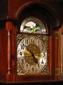
| 02/23/2004 07:21:09 PM |
Timeby frateComment by Rgarcia: Great texture subject, nice texture contrasts. Beautiful shot. |
| 02/22/2004 12:09:35 AM |
Timeby frateComment by RedHotKK: Wow, that is a beautiful clock! Pretty good job with the texture. |
| 02/21/2004 01:11:32 AM |
Timeby frateComment by Mousie: Nice exposure, but the hands of the clock could be at a more intresting angle. :) |
 Photographer found comment helpful. Photographer found comment helpful. |
| 02/20/2004 11:07:20 AM |
Timeby frateComment by drgsoell: A bit closer would show off the relief around the clock face better. |
| Photographer found comment helpful. |
| 02/20/2004 06:17:29 AM |
Timeby frateComment by TampaDan: Why not a shot of just the clock, without so much of the surrounding cabinet? I think it would have more visual impact. |
| Photographer found comment helpful. |
| 02/20/2004 04:49:54 AM |
Timeby frateComment by e301: Some impression of the quality of these surfaces, though really quite an ordinary illustration of the clock face. Lacks that dynamic that comes from good lighting, from a less straightforward approach. Good exposure, and accurate colours and sense of the object itself, but the shot hasn't placed the emphasis on the textures really - would need more careful consideration of the affect of light on a surface in that area. |
| Photographer found comment helpful. |
| 02/20/2004 02:42:34 AM |
Timeby frateComment by jonpink: a bit snap shotty to me, like composition hasn't been though of much. |
| 02/19/2004 07:33:47 PM |
Timeby frateComment by blueswolf58: Too much to look at. Get in closer and choose a main subject to focus on would really improve this shot. A famous photographer's theory was that if his pictures looked too static, it was because he wasn't close enough. |
| Photographer found comment helpful. |
Home -
Challenges -
Community -
League -
Photos -
Cameras -
Lenses -
Learn -
Help -
Terms of Use -
Privacy -
Top ^
DPChallenge, and website content and design, Copyright © 2001-2025 Challenging Technologies, LLC.
All digital photo copyrights belong to the photographers and may not be used without permission.
Current Server Time: 04/07/2025 06:53:25 AM EDT.