| Image |
Comment |
| 09/22/2002 01:38:00 PM |
|
| 09/20/2002 11:50:00 AM |
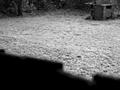
incineratorby stormbikesComment by karmat: While I feel that the dark area at the front of the picture is intentional, it is a little too softly focused for my personal taste. Cropping so that the grass area was your negative space may have been as effective. karmat |
| 09/20/2002 11:15:00 AM |
|
| 09/19/2002 11:26:00 PM |
incineratorby stormbikesComment by Yomi: Good shot. This would have worked more for me if the shadow in the foreground wasn't there and just the grass and the stove thing. 5 |
| 09/19/2002 12:39:00 PM |
incineratorby stormbikesComment by mjcecil: I was thinking this is awful simple. But, as I look more, I feel the space between the foreground wall, and the incinerator implies a fear of the incinerator, and I like the effect it has on me as a viewer. 7.5 -> 8 |
| 09/18/2002 10:02:00 AM |
|
| 09/16/2002 10:09:00 PM |
|
| 09/16/2002 08:08:00 PM |
incineratorby stormbikesComment by rcrawford: I like the concept of this photo but the fence is distracting and the incinerator feels like it is too much in the corner of the photo to be the main subject. rcrawford |
| 09/16/2002 03:07:00 PM |
|
| 09/16/2002 12:19:00 PM |
|
Home -
Challenges -
Community -
League -
Photos -
Cameras -
Lenses -
Learn -
Help -
Terms of Use -
Privacy -
Top ^
DPChallenge, and website content and design, Copyright © 2001-2025 Challenging Technologies, LLC.
All digital photo copyrights belong to the photographers and may not be used without permission.
Current Server Time: 04/09/2025 11:01:09 AM EDT.