DPChallenge: A Digital Photography Contest You are not logged in. (log in or register
 
Browse Settings
Currently viewing:
Registered Usersaraclicks

Show comments:

Per page:

Order:

Comments:


Comments Received by saraclicks
Pages:   ... ...
Showing 71 - 80 of ~134
Image Comment
thus spake...
09/02/2012 12:29:08 PM
thus spake...
by saraclicks

Comment by Ammie:
A snapshot?
e-Plant
09/01/2012 09:52:46 AM
e-Plant
by saraclicks

Comment by sophiawood:
10 - wonderfully creative
e-Plant
09/01/2012 03:50:01 AM
e-Plant
by saraclicks

Comment by FrankRobinson:
Nice idea - interesting that this actually justifies selective desat! Rare, that.
thus spake...
08/31/2012 12:28:22 PM
thus spake...
by saraclicks

Comment by bobnospum:
Intersting, feels like 1970's film. The interaction of the people is great. Pillers and yellow backdrop are kind of uninteresting.
thus spake...
08/30/2012 11:19:48 PM
thus spake...
by saraclicks

Comment by ray_mefarso:
lovely vintage feel...
e-Plant
08/30/2012 08:33:37 PM
e-Plant
by saraclicks

Comment by Lydia:
Plant City!


Fur sure. :D


(commenting only)
thus spake...
08/30/2012 10:09:37 AM
thus spake...
by saraclicks

Comment by bmartuch:
The colors and the composition are amazing.
thus spake...
08/29/2012 08:05:46 PM
thus spake...
by saraclicks

Comment by Melethia:
Almost has a frat house feel with a cinematic overlay in Miami....
Dark & Light
08/29/2012 12:32:16 PM
Dark & Light
by saraclicks

Comment by FrankRobinson:
HI Saravanan, welcome to the Critique Zone!

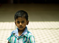
Interesting idea, a portrait lit from above. Tricky, because of the lighting angle and the shape of the head. Obviously in a traditional portrait the emphasis would be on the eyes (especially for such a cute little guy!) but here that is just where the shadow is guaranteed to fall. Perhaps an opportunity for a story? Something along the lines of the 'forgotten' or 'anonymity'?

Technically, it could be better - it's pretty soft and the lighting is blown out on his shirt. I'm surprised that you went down to f1.8 on this lens. It'll definitely take it but it doesn't give much margin for error. You could easily have stepped down to f5.6, where this lens is razor sharp.

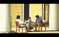
Artistically, for me the real problem is that there isn't a story to follow here. It's a compositional problem - with the eye automatically moving left to right, I prefer an isolated subject at the right (end) of the frame rather than the left (beginning). The light/dark boundary also runs straight through his head, which is unfortunate. And finally, his vertical position in the frame - its very central surrounded by lots of space. Just doesn't grab me.

I'm sorry if this all sounds a little negative - the tweaks to have a really great shot here are pretty small and your model is fantastic - I am sure you could ribbon with him if you keep playing with the settings and shot style. I hope something in this rambling is useful to you!

Happy hunting,

Frank.
thus spake...
08/28/2012 05:11:24 PM
thus spake...
by saraclicks

Comment by SandyP:
I love this one. I think the bright colors are so refreshing, and the guys still look like guys in a "street photo".
Pages:   ... ...
Showing 71 - 80 of ~134


Home - Challenges - Community - League - Photos - Cameras - Lenses - Learn - Help - Terms of Use - Privacy - Top ^
DPChallenge, and website content and design, Copyright © 2001-2025 Challenging Technologies, LLC.
All digital photo copyrights belong to the photographers and may not be used without permission.
Current Server Time: 04/07/2025 09:49:14 AM EDT.