| Image |
Comment |
| 11/29/2006 03:16:25 AM |
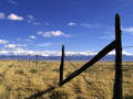
Colorful Coloradoby bseifipourComment by magicfinger: I'm in two minds about this - the foreground is really strong (especially the contrast of the long diagonal of the perspective vs the support post with the strainer wire) , but setting the horizon on the bottom third does nothing for me. |
 Photographer found comment helpful. Photographer found comment helpful. |
| 09/06/2006 07:18:55 PM |
|
| Photographer found comment helpful. |
| 09/04/2006 11:48:25 AM |
|
| Photographer found comment helpful. |
| 09/04/2006 10:21:41 AM |
|
| Photographer found comment helpful. |
| 09/02/2006 05:27:48 PM |
|
| Photographer found comment helpful. |
| 09/02/2006 12:20:04 PM |
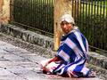
Cuernavaca Beggarby bseifipourComment by Brad: While many will only submit a wow shot to a free study, I applaud you in showing us a scene we so often view, but do not want to see.
Strong message and story being told here. |
| Photographer found comment helpful. |
| 09/02/2006 05:03:51 AM |
Cuernavaca Beggarby bseifipourComment by Elvis_L: doesn't seem real sharp. not alot of interest for me. I'm not sure I like the angle and while your title tells me she is a begger she looks pretty good and could just as easily be someone taking a rest. |
| Photographer found comment helpful. |
| 09/01/2006 05:43:02 PM |
Cuernavaca Beggarby bseifipourComment by twm122: Her face is intense. Did you get any tight shots? Ilike your colors alot in this one. I think leaving it in color was a good choice. |
| Photographer found comment helpful. |
| 08/31/2006 08:50:43 PM |
|
| Photographer found comment helpful. |
| 04/29/2006 09:07:17 AM |
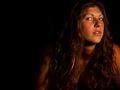
Spicyby bseifipourComment by wavelength: Hola! From the Critique Club!
Wassup Brian.
I think, for this challenge especially, that a tigher crop/composition were needed. The negative space here might seem artsy, but what people really wanted to see were faces, faces, and more of their faces. The top 9 were all tight crops, (#10 had other things distracting from the face) and 8 of the next 10 were tighter crops. That makes 17 of 20 at the top tight, mostly face crops in my estimation.
The negative space here is just a bit too much I think. The eyes are great, but, again, a tighter crop could have served to highlight them. He r face is turned a little too much away from the camera, and thus the viewer. Automatically takes a bit of the connection out of it. Turning her face down a bit and more toward the viewer, makes for a better pose.
The lighting is great, I like that, a bit more highlight on all the great hair would have done you well also. |
| Photographer found comment helpful. |
Home -
Challenges -
Community -
League -
Photos -
Cameras -
Lenses -
Learn -
Help -
Terms of Use -
Privacy -
Top ^
DPChallenge, and website content and design, Copyright © 2001-2025 Challenging Technologies, LLC.
All digital photo copyrights belong to the photographers and may not be used without permission.
Current Server Time: 04/07/2025 09:26:55 AM EDT.