| Image |
Comment |
| 09/17/2007 03:54:06 PM |
day 17by digitalpinsComment by Rooster: The best part of this shot for me is the point of view. Really great stuff! Adds a bit more interest! |
| 09/17/2007 03:50:50 PM |
day 17by digitalpinsComment by jasonlprice: Another very interesting composition! I love the face dead center and the darkness at the top, but I don't really like the "stuff" in the foreground right. It doesn't seem to fit the composition. Great tones once again! |
| 09/17/2007 11:22:14 AM |
|
| 09/17/2007 10:47:03 AM |
|
| 09/17/2007 08:51:54 AM |
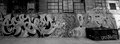
day-15by digitalpinsComment by cogerox: This is a bit flat. I think a little more contrast would make the graffiti stand out better. Also, you could play with perspective and angle - take the shot from the edge of the box looking down the wall, for instance. |
| 09/16/2007 02:19:09 PM |
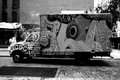
day-16by digitalpinsComment by dtremain: This just goes to show - before you let your new boyfriend paint your van - get references. This definitely falls into the "What were they thinking...?" category. Nice capture. |
| 09/16/2007 10:51:27 AM |
day-16by digitalpinsComment by figaro: One of your best ones. I'd really like to see one of these with selective desat. To see some kind of bright green or red jumping out of image would really emphasise the eclecticism of the subject and add extra interest. |
| 09/15/2007 06:26:43 PM |
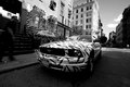
day-14 Mustangby digitalpinsComment by violinist123: Cool perspective and a cool looking car. Too bad the light wasn't a bit brighter on the car, but then all the detail would likely have blown itself to hell anyway. Really cool.
edit: holy shit I just saw this was a digitalpins shot! Welcome back from the bad side of town! Message edited by author 2007-09-15 22:27:08. |
| 09/15/2007 09:51:52 AM |
day-15by digitalpinsComment by dtremain: Who says graffiti isn't art? That looks pretty wild. Not sure what you were working with here, but your photo goes from darker on the left to light on the right - not sure if it would be possible to balance that lighting better. For me, I think you could crop off the right just before the large black box on the ground and still have a very nice shot with less lighting issues. Nice shapes, especially with the bricks. This one might be fun to see in color. |
| 09/14/2007 07:01:44 PM |
day-14 Mustangby digitalpinsComment by dtremain: Um how could you miss with a black & white zebra striped car? Seriously, this is a very nice shot on many levels, and the unusual zebra store front and car just add a bit of the unusual and enhances interest. Your lower angle I think makes this shot - much more interesting than the PT Cruiser shot. |
Home -
Challenges -
Community -
League -
Photos -
Cameras -
Lenses -
Learn -
Help -
Terms of Use -
Privacy -
Top ^
DPChallenge, and website content and design, Copyright © 2001-2025 Challenging Technologies, LLC.
All digital photo copyrights belong to the photographers and may not be used without permission.
Current Server Time: 04/07/2025 09:35:29 AM EDT.