| Image |
Comment |
| 01/24/2012 05:44:05 AM |
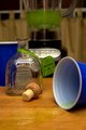
Thanks for the memories...by bargleComment by Alyn: Your main focus is clearly the bottom of the image. You have a lot of nice lines leading to the spilled beverage, however, that spill is also pushing my eyes out of the image. I like the subtle reflection of the tequila bottle in the spill, it may have been advantageous to play on that a little more. I think the background (upwards of the tequila bottle) is a bit distracting and doesn't have a main focus. Yes I understand the blender, but even behind the blender has a lot of geometry that doesn't add, but even distracts from your main focus.
The image is a bit cramped and doesn't convey partying to me; it conveys more of a personal, one-man party. However, I think the theme was a good shot. |
| 01/21/2012 08:10:40 AM |
Show me the money!by bargleComment by snaffles: Greetings from the Critique Club!
First impression: I like this shot, esp the oof poker chips flanking the cards. But would like to have seen it shot from slightly higher up.
Artistic: The red looks a tad on the pinky side (however I am not at my own computer at the moment), but I find the selective desat works well. I don't feel that the deck of cards to the right adds to the shot very much.
Technical: The crop on the left is pretty tight to the cards; I'd've allowed more room for the cards on the left and cropped in on the right. A more diagonal angle, perhaps from a left corner to the opposing right one, would have made a stronger image. Lighting OK for this kind of shot. The red smudge (meant to be part of a chip?) by itself just below the cards, to the left, is a bit distracting. Your pp is fine and not overdone, it enhances the idea nicely without taking away from it.
Overall: A very good attempt, and score, especially as a first entry here! You're on the right track, just keep shooting and entering.
Feel free to PM me,
Susan |
| 01/19/2012 06:20:04 PM |
|
 Photographer found comment helpful. Photographer found comment helpful. |
| 01/18/2012 10:15:32 PM |
|
| Photographer found comment helpful. |
| 01/18/2012 07:12:01 PM |
Grow Closer with God..by bargleComment by MarioPierre: I often meditate and where I go in my mind looks a lot like this so this definitely goes well with your theme, very good. I'd say that the weakest part of the image is the composition which isn't the most dynamic but the strong color contrast makes up for it I guess. |
| Photographer found comment helpful. |
| 01/18/2012 05:34:23 AM |
|
| 01/17/2012 10:34:23 AM |
|
| Photographer found comment helpful. |
| 01/16/2012 11:51:47 AM |
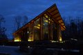
Grow Closer with God..by bargleComment by mcaldo: I like the contrasting hue of the outside VS church, and the framing. There are a few things that, in my opinion, could have made the image more effective and self descriptive, even without any title.
The hue of the church shows a bit yellowish, at least on my monitor, a slightly warmer cast would have made for a more inviting focal point to the image. Detail on the church could be better, perhaps a case for using a tripod. A framing or some element suggesting inquivocably that this is a church would have gone a long way makign the concept clear without any title. I am unsure about the inclusion of the house on the left, a crop exclusing it might simplify the image leaving only looming woods and church. Just my opinion, no offence taken I hope. |
| Photographer found comment helpful. |
| 01/14/2012 03:47:10 PM |
Show me the money!by bargleComment by PenelopeK: Sadly, the out of focus red (and white) in the foreground is what my eye gets drawn to, and it becomes a major distraction from anything else going on in the image. |
| Photographer found comment helpful. |
| 01/14/2012 03:54:52 AM |
|
| Photographer found comment helpful. |
Home -
Challenges -
Community -
League -
Photos -
Cameras -
Lenses -
Learn -
Help -
Terms of Use -
Privacy -
Top ^
DPChallenge, and website content and design, Copyright © 2001-2025 Challenging Technologies, LLC.
All digital photo copyrights belong to the photographers and may not be used without permission.
Current Server Time: 04/09/2025 12:48:43 AM EDT.