| Image |
Comment |
| 02/23/2006 07:57:17 AM |
Angled Skyby reeveyComment by persimon: Clean lines! Very detailed and focused. Sharp. I don't think it will do well in this challenge though. Don't be discouraged. |
 Photographer found comment helpful. Photographer found comment helpful. |
| 02/22/2006 09:47:16 PM |
Angled Skyby reeveyComment by owen: Nice blue sky and nice clouds. Good to see a strong colour used. |
| Photographer found comment helpful. |
| 02/22/2006 01:05:02 PM |
Angled Skyby reeveyComment by jfwolpert: Duotone
Duotones are images that only display in two colors. Like most visual techniques on the Web, duotones come from the world of print. In print, the more colors you use, the slower the production time and the higher the cost, so duotones were often an economical alternative. Duotones can also improve efficiency on the Web by enabling the creation of cool-looking images with small file sizes. Duotones are made by first creating a grayscale image and then overlaying it with a different specified color. |
| Photographer found comment helpful. |
| 02/16/2006 03:10:59 PM |
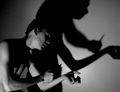
the end...by reeveyComment by sfalice: Greetings from the Critique Club
Love your lighting in your Shadow entry. It's always good to leave a little mystery in the picture and you certainly did that with your lighting and your subject matter. Technicals are good, I think, and the composition works well. I can only think that the subject matter brought your score down a bit. The implication of 'cutting' or 'self-inflicted wounds" is a frightening one to many people.
Still you did get a fairly good score, probably because no one could argue with the fact that you certainly met the Challenge, head on. Perhaps a less dark (no pun intended) subject next time will bring a better score your way. You have the technical skill.
I'll look forward to seeing more of your work on DPC.
Alice |
| Photographer found comment helpful. |
| 02/06/2006 09:41:24 AM |
Jess 5.jpgby reeveyComment by Jutilda: Nice post editing. Probably not everyone's taste, but I appreciate the artistic aspects of it. |
| 02/04/2006 07:51:39 AM |
|
| 02/03/2006 09:29:56 AM |
the end...by reeveyComment by Imagineer: Bloody hell - let's hope trying to find a shot for this challenge wasn't too taxing!
Good light and comp. Your shadow reminds me of the Aphex Twin video by Chris Cunningham - 'Come to Daddy'. |
| Photographer found comment helpful. |
| 04/24/2005 12:54:21 PM |
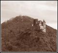
Burg Mausby reeveyComment by jemison: great scene...I think it could use a bit more contrast - seems sort of flat |
| Photographer found comment helpful. |
| 04/24/2005 09:54:15 AM |
Burg Mausby reeveyComment by Sammie: This is a beautiful scene and I don't think the sepia does it justice. There isn't enough contrast to show the detail in the picture. I would have loved to see it in color and I think B & W would have shown it off better than the sepia. |
| Photographer found comment helpful. |
| 04/23/2005 07:52:37 AM |
Burg Mausby reeveyComment by Catherine_B: This photo is detracted by the sepia tones. The object of interest, the castle, is too far away and the mountain doesn't add to the impact. I would have made the castle a bigger part of the image. |
| Photographer found comment helpful. |
Home -
Challenges -
Community -
League -
Photos -
Cameras -
Lenses -
Learn -
Help -
Terms of Use -
Privacy -
Top ^
DPChallenge, and website content and design, Copyright © 2001-2025 Challenging Technologies, LLC.
All digital photo copyrights belong to the photographers and may not be used without permission.
Current Server Time: 04/07/2025 11:47:47 AM EDT.